Abstract
Art historically relevant visual knowledge can be deconstructed and the resulting
components of this visual knowledge — visual discernments — lend themselves to be
socially negotiated. Individual visual experts (like connoisseurs) do not share some
grand and undividable cognitive cataloguing system; they are attentive to piecemeal
visual discernments and the patterns in which these occur in reality. In conventional
scholarly communication sophisticated tools to discuss perceptual patterns are
lacking. This paper not only proposes a theoretical model of visual knowledge
accumulation, but also describes a practical implementation, Art.Similarities, which is designed as a prototype of such a
sophisticated tool. Using a custom-made interface it records visual behavior: the
non-verbally expressed visual similarity judgments of distributed individuals. Users
can be assigned to groups according to the qualities of their judgments. These
qualities may be distilled from emerging similarity patterns. The implications of
individual judgments in different user groups may vary considerably. Emerging
patterns can be assessed both according to human analysis and statistical procedures.
Most studies on art evaluation are attentive to either the characteristics of works,
or the characteristics of observers. In this study both are considered as
interdependent entities consistently.
Introduction
Without being aware of the underlying technologies, our behavior is frequently
recorded, assessed, and fed back to us via today's Web interfaces. Information
systems are now far more advanced in mirroring preferences, curiosities, and yes,
knowledge, than they were, say, five years ago. The example which is
familiar to us all is Amazon.com.
[1] The world's largest bookstore makes clever use of the newest
collaborative filtering technology.
[2] From a
complex database of recorded consumer behavior persuasive, personalized web pages are
generated. The idea behind the process is that statistically combining traces of user
behavior will yield knowledge about user interests.
[3] If you have ever
ordered a book that was suggested to you by Amazon, that forms the best proof of the
success of the collaborative filtering approach.
Looking at the basic idea behind collaborative filtering systems, one may wonder
whether this concept is applicable to the humanities, where the expression of value
judgments (as against stating incontrovertible facts) is of such importance. Building
a collaborative filtering tool involves first establishing what are supposed to be
relevant data, and then modeling the way these data may be recorded and organized, in
order to turn data into information, and perhaps collaborative knowledge.
[4]
This paper discusses a field test in collaboratively establishing visual
similarities, a topic of concern in art history.
Art.Similarities is the experimental application used to sample visual
similarity judgments.
[5] The experiment could be relevant for other
disciplines than the history of art, both inside and outside the humanities.
The bulk of research in distributed cognition is text-based — as we shall see in the
next paragraph. For this type of research in information science and cognitive
psychology an example in the domain of visual cognition may be advantageous. In
particular crossing off the intermediary function of verbal language, may encourage
the development of scenarios for combining transactional data (partial observations
of visual artifacts) to construct emergent knowledge (holistic representations). This
is why I believe that in its consequences this field test could support
cross-cultural comparisons in visual cognition.
I also expect that the project may shine a new light on the relation between the
cultural interpretation of images and words on one side, and the relation between
such cultural interpretations and objective image data, e.g. as produced by
content-based image retrieval technologies [
Eakins & Graham 1999], on the other
side. In other words: it could help tracing the line between objective visual facts
(as captured for instance in a color histogram) and more interpretive “truths”.
In the practical sphere, because visual attention becomes partly measurable and
comparable, the project may contribute to the development of educational
applications, in which students learn to reflect on culture as a determinant of
visual cognition. And because the interconnectedness of base distinctions and more
evolved cultural knowledge is worked out computationally, it becomes conceivable that
by means of technology subjects will be offered the tools to vary the compositional
elements of a visual configuration, just as when you add or remove query strings
based on intermediate search results, when searching large volumes of texts.
I presume that the latent possibilities of the Art.Similarities experiment will only come to the fore when we do not
discuss it in isolation. Therefore consider in advance that interesting alternatives
may evolve when varying such dimensions as:
- the scale on which the application is used (small, maybe local communities
versus large, global crowds);
- a focus on gathering coherent large scale data versus a focus on developing
various applications (to be populated with different sets of data);
- the application in isolation versus the application as a building block in more
complicated dedicated software (e.g. as one of the options to organize visual
materials in image databases or image processing software).
Such dimensions are important in assessing the usefulness of the experiment. Just to
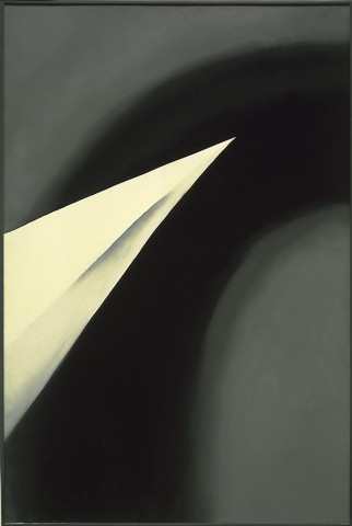
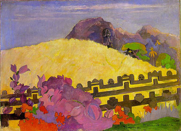
get an idea of the kind of problem addressed here, consider these two works of art,
dating from the early 1930s:
Both images show a striking overall similarity. Experienced observers seeing these
works of art, may draw conclusions about artistic influences. And indeed, artists are
observers by profession, adopting typical ways of expressing visual thoughts in new
visual configurations. The history of art has documented innumerable instances of
both explicit and implicit borrowing of formal traits and configurations.
[6] This is partly
motivated by the common assumption that visual phenomena in cultural artifacts are
indices of material, personal and social conditions during the time of creation.
Establishing visual similarities is part of the groundwork in the field of art
history, but making these similarity observations verifiable is precisely where the
conventional systems of scholarly communication fail, since neither do we have an
effective way of discussing visual similarities, nor do we have the means to trace
observed similarities in large collections of images.
[7]
Collaborative Knowledge
In recent years we have seen several attempts at constructing frameworks for the
study of collaborative knowledge. The subject was variously denoted with terms such
as “distributed cognition”, “social cognition”, “situated cognition”,
or “group cognition”. The urge to develop theory in this field has increased
dramatically since the waves of hypertext enthusiasm in the late 1980s and early
1990s, the subsequent rise of the world wide web and later semantic web, and the
popularization, recently, of social software, of which the collaborative filtering
systems mentioned earlier are an omnipresent example. In theories of collaborative
knowledge the psychology of Lev Vygotsky, who may have been one of the first to
envision a socially constructed mind, is frequently referred to. His
Mind in Society dates back to 1930 [
Vygotsky 1976]. Gavriel Salomon stressed the importance of the
complementary concepts of “shared cognition” (knowledge of the world which is
continuously established through live interactions among individuals) and
“off-loaded cognition” (recording and processing cognitive facts and
functions to realia, such as concept maps) [
Salomon 1996]. In 1995
Edwin Hutchins published another influential book,
Cognition in
the Wild, where the author uses the metaphor of ship navigation to
pinpoint the cultural nature of cognition: no single individual from the ship's crew
is capable of managing all the complex operations that are necessary to sail [
Hutchins 1995].
Important building blocks of frameworks for collaborative knowledge are: thought
processes, as distributed amongst a group of individuals, representations of these
thought processes, as captured in external realia, and mediating processes (i.e.
computer systems) that are capable of coordinating both internal and external
representations and lifting the newly generated forms of knowledge above the level of
consciousness of the individual.
A recent attempt to theorize in this field is Gerry Stahl’s book
Group Cognition: Computer Support for Building Collaborative Knowledge
[
Stahl 2006]. On the basis of a series of experiments, in which the
promise of computer supported knowledge negotiation has been tested, Stahl analyses
the mechanisms of collaborative knowledge building and ends by presenting a tentative
theory of group cognition. In Stahl’s model the sphere of personal understanding is
opposed to and merges with a cycle of social knowledge building. Individuals
articulate – in public statements – personal perspectives, which in a process of
argumentation and rationale are being assimilated with the perspectives of other
individuals into collaborative knowledge. This collaborative knowledge is formalized
and objectified in cultural artifacts that can be observed and known by individuals.
Et cetera. Stahl’s model may help pointing out the stages of the process of knowledge
construction and thus facilitate the design of specific forms of computer support
[
Stahl 2006, 207].
Typical for Stahl’s approach is his focus on verbal discourse. Although in some of
his experiments schematic representations of e.g. floor plans or network
architectures are crucial to the tasks of his subjects, in most of the experiments he
uses chat-like conversations and threaded discussions to unfold his theory. But the
kind of knowledge being researched here is visual knowledge constructed by visual
means. As yet I have found no models of distributed cognition covering this
particular domain. In my model the visual discernments (“personal focus”) of
individuals are expressed (“off-loaded”) in visual images, where the computer
records and mediates (“negotiation of perspectives”).
Basic Assumptions
It is taken for granted in this study that the visual appearance of a cultural
artifact, and thus its potential similarity to other artifacts, is resolvable into
literally innumerable formal qualities. Two artifacts may share any number of formal
qualities, and these are thought to somehow account for their similarity. Two
(visually) identical (=maximally similar) artifacts share immense quantities of
visual characteristics, whereas for two very dissimilar artifacts the number of
shared visual traits is minimal. In between the extremes the rule would be that
the more two cultural artifacts share a set of singular formal/visual
attributes/traits, the more they are experienced as being similar to one
another.
[8]
In other words: the actually perceived similarity is defined as the function of an
unspecified number of trait-to-trait similarities.
In order to avoid endless image dissections, another assumption adopted here is that
the overall visual appearance of a cultural artifact in fact approximates to the
weighted sum of relatively few, but
distinctive formal/visual
attributes/traits. So I assume that culture is a decisive factor in subjects focusing
on specific image characteristics: the threat of an infinite number of physical
features is being balanced by cultural determinants.
[9]
Observers have a number of options to denote a visual concept [
Nauta 2001]. In most of these options abstract symbols (words, numbers,
etc.) signify visual similarities. Two options, however, concern iconic references.
One focuses on the simultaneous display of multiple instances of similar artifacts
along one or several specific attribute(s). For instance, Santini, Gupta and Jain
discuss an experimental interface in which the user is allowed “to manipulate not only the individual
images, but also the relation between them”
[
Santini et al. 2001]. An example of fairly successful content-based image retrieval is the system
developed by D.P. Huijsmans et al. for the
Leiden 19th-Century
Portrait Database (LCPD), a database of Dutch carte-de-visite studio
portraits (1860-1914). One of the options for consulting the LCPD is a so-called
“relevance feedback” interface. After each retrieval action the user is
presented a table of results. Feedback is given by just clicking the photographs that
are close to what the user was looking for, whereupon the system — using
pre-calculated image characteristics — offers a new set of images, ideally closer
matching the user's preferences. Et cetera. [
Huijsmans & Smeulders 1999] In the
other type of iconic denotation, the one elaborated here, image similarities are
indicated by simple images exemplifying a restricted set of formal
attributes.
[10] These simple images are thus conceived as
visual denotats.
[11] So where Santini et al. avoid immediate deconstruction of
holistic appearances, this paper will explicitly
analyze similarities in
considering
iconic denotations.
[12] In this way, problematic verbal
denomination issues will be evaded. Present-day computers are perfectly suited to
create systems for communicating pronouncements on matters of visual similarities
through instant presentation of instances.
[13]
Another assumption concerning the similarity of artifacts has to do with the quantity
of common visual traits. Where two visual artifacts share a substantial number of
different visual traits, we say that these artifacts manifest multi-trait
similarity. The notion of “style” may be akin to this concept. In the
vocabulary of this article style could be defined as multi-trait similarity
occurring across multiple images.
Apart from considering the number of visual traits two artifacts have in common, it
is important to recognize that the relative weight of these visual
traits is of interest: the more observers indicate they have discerned one particular
trait, the more relevant this trait will be in any function defining the visual
similarity of the artifact to any other artifact. Of course it should be kept in mind
that relevance is dependent on the group these observers belong to. We
are not considering facts. We need individual human observers to assess
the visual qualities of artifacts. And assessments may either apply to the entire
surface of a visual artifact or to only a segment of that surface. Once these
assessments are recorded they can be analyzed. And the more individuals are involved
in assessing visual qualities, the greater the cultural relevance of these
assessments will be. Patterns in individual assessments, calculated for
social groups, may reveal “high order” notions (such as — perhaps —
stylistic notions). That an individual observer giving individual
assessments need not be conscious of these high order notions is a fascinating
idea.
Hypothesis
The following hypothesis aims at focusing the points made so far: The social
formation of opinions concerning the visual similarity of cultural artifacts amongst
a group of motivated observers can be modeled and recorded without the
application of verbal descriptors, using information technology (web technology,
databases, statistics), in such a way as to make real use of archived records for
purposes like: getting to know broad classes of image attributes; retrieving related
images; and learning the preferences and perceptual biases of user classes and
individual users.
Experimental Setup
In order to test the hypothesis an experimental application — Art.Similarities — had to be developed, offering access to a modest
quantity of digital images. The application interface had to be constructed in such a
way that it would be relatively easy for observers to link visual icons from a
restricted but varied set to the digital objects in the collection. Every transaction
involving the database would have to be recorded to be able to quantitatively compare
the visual discernments of different observers.
Here is an approximation of the processes the application should ideally support:
- Users identify themselves. New users may be asked to submit a
preprocessing user profile, containing data such as: name, age,
sex, professional affiliation, etc. Returning users just log in.
- Novice users are assigned Level 1 privileges, meaning that they are allowed to
assess single trait similarities (artifact-icon associations; explained below).
- A sequence of artifacts is being displayed, one by one, in random order. The
Level 1 user is invited to select an appealing work.
- The selected artifact is presented together with a set of uniform, but visually
maximally diverse icons.
- Level 1 users distinguish single trait similarities between the simple (
“attenuated”) images (icons) and
(“replete”) artifact reproductions, and fix these
similarities by means of icon-artifact attributions (one by one).[14]
- Attribution data are recorded, together with user IDs, date stamps, etc.
- The preceding steps (i.e. the attribution process) can be repeated, until the
user indicates he/she wishes to stop interactions.
- Since the artifact similarity measures are precisely quantified, statistical
procedures may be applied to the records in the database. This will yield
artifact profiles.
- Over time, artifact profiles will be generated/recorded, consisting of sets of
icon references related to individual images, together with user IDs.
- Artifact profiles may be displayed. Repeated artifact-icon associations will
become apparent immediately.
- Artifact similarity measures may be deduced from artifact profiles. These
similarities are either single trait (t=1) or multiple trait (t=N) similarities.
- Based on similarity measures the system can retrieve and display artifacts
“like” the one the user started with (~similarity-groups; s-groups).
- The profile (in terms icons referred to) of any one of the retrieved artifacts
can be inspected individually. This way the user will be able to examine multiple
formal perspectives relevant for a given artifact.
- The user must be able to ask for recorded data concerning each and every
artifact-icon association.
- The more artifact-icon assignments a user makes, the more precise a post
processing user profile will freeze his visual cognition (behavior).
- Following a preconceived algorithm the coherence of both preprocessing and post
processing user profiles may be analyzed. The outcome may be fed into a process of
user classification.
- Either based on the preprocessing user profile only, or based on the analysis
just mentioned, some users may gain the status of Level 2 users (~superpeers).
- Level 2 users assess high-order artifact qualifications (profiles), thus either
implicitly or explicitly approving both perceived inter-artifact similarities and
Level 1 user articulations.
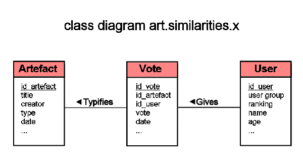
Technical Elaboration
Object Modeling and Database Design
Although the combinatorial nature of calculating visual similarities may
eventually lead to a data explosion, the actual number of object classes in this
experiment is limited. There are
users/observers,
visual
artifacts, and
votes, expressed by means of icons that are
indicative of perceived visual traits.
[15] For the object types in the experiment open
standards were adhered to wherever possible:
- Visual artifacts were catalogued using the CDWA metadata scheme
[Baca & Harpring 2005]. Among the attributes in the database are creator
name, title, date, etc. In the class diagram below only a subset of the full
set has been incorporated.
-
Users/observers were classified according to common attributes
like name and other personal data such as address, gender, age, etc. Specific
attributes indicative of observer classes are: education, profession and
expertise.[16]
- To keep it simple votes were initially recorded with only a
minimum of attributes: a key referring to one of the icons, references to the
table of users (user name) and artifacts (object id), and a date (and time)
stamp.[17]
The basic design of the database consisted of only three related tables. Two of
these (the
artifacts and
votes table, see below) were so
arranged as to be able to log all transactions. The third table (the
user table) serves the purpose of identifying specific users and —
in the next phase — recording the results of an analysis of performance
data.
[18]
Figure 3 shows a class diagram of the system:
Interface Design
In this experimental pilot the interface was designed as straightforward as
possible, with a firm eye on both database design and the basic tasks the users of
the application should be able to perform. As to these tasks the decision has been
to keep two different activities clearly separated: editing and
browsing/searching. These activities were reflected in two different interface
modes: editing mode and serendipity mode. The design of
these modes was based on slightly different principles. Switching from one mode to
the other, however, had to be self-explanatory. Within each of the modes media
objects, metadata, and interaction controls were placed within one and the same
screen (no overlapping windows). Still in both modes a clear balance was sought
between the object/artifact of the user's present focus/attention and images for
comparison, whether these would be simple icons or replete (thumbnails of)
artifacts.
Textual data were kept to a minimum. For navigation of the data collection the
decision was to rely on either random presentations (e.g. on starting
an interactive session) or pointing and clicking. Although the
underlying database of artifacts did in fact enable it, no textual search options
were offered. Since throughout a session the identity of the user should be known,
the first step of working with the program was authentication.
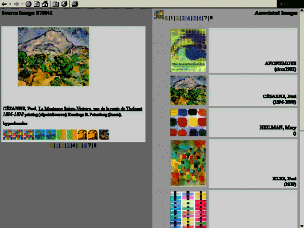
Here are two screendumps from Art.Similarities:
Implementation
For the population of the artifact file a collection of about 400 reproductions of
2D artifacts and matching descriptive metadata was imported into the database.
This special purpose data set was compiled to have a research collection, with a
variety of provenances, media types, and formal characteristics. The controlled
addition of test pairs of similar images was considered, but to avoid complexity
it was decided to elaborate on this line of thought in a follow-up.
[19]
For pragmatic reasons in the experimental setup a more or less justifiable set of
icons was used. Students produced icons in dedicated assignments; others were
created by the author or were found on the Internet. Undoubtedly this will bring
some bias to the experiment. I will come back to the selection of indexing items
in the final section.
The number and size of icons had to be decided upon as well. Since for some time
to come the major impediment to rich visual comparisons will be the size and
resolution of display devices the use of large sets of icons of considerable pixel
dimensions, would go at the expense of the space available for the presentation of
the artifact under consideration. Since the simultaneous display of both icons and
artifact was considered desirable, the provisional layout was fixed at 1 artifact
and 100 icons.
Use
In five subsequent years (2003-2007) BA students in the history of art tested the
Art.Similarities application. Students could
approach the system from any PC connected to the Internet. Some 4000 interactions
(icon-artifact pairs) on a total of about 200 users were logged, so the average
number of indexing results per user in this pilot is about 20. Since the design
philosophy was to make the application as simple as possible, no help function was
offered. And indeed, students had no difficulties in using the program. The
analysis below is based on the database logs of this pilot. Some evidence comes
from an additional paper survey.
An Analysis of Results
Since the experiment considers three object types — observers, artifacts, icons — and
since these object types are systematically interrelated — observers assign icons to
works of art — the analysis may extend into at least three fields of semantic
relevance. The primary concern is with how artifacts will be typified or defined as
being more or less similar to one another. But an analysis of patterns in observer
behavior and the covariance of icon-image assignments can equally yield interesting
results.
Before we turn to an inspection of the collected data, however, a few words must be
added on the representativeness of the sample. The following analysis of data is
explorative. In comparison with today’s large-scale commercial data warehouses the
couple of thousand of records in my transaction database is very small. In the real
world data mining techniques will not be used on data sets of this size. Add to this
that data were not collected systematically: subjects were not asked to visually tag
a fixed number of artifacts; they were free to start or stop tagging any time, and
artifacts were presented at random. The only choice the subjects had was to skip an
artifact and go on with the next object displayed. As a result the choice of
artifacts and the distribution of visual tags across the objects represented in the
database cannot be fully representative. Still it was decided not to normalize data
routinely. The meaning of differing tagging frequencies could be relevant. Below the
results of the Art.Similarities experiment will mostly
be explored on the basis of raw data, especially where the similarity of artifacts is
under consideration.
The setup of the test application is fairly simple. Nevertheless an analysis of
database logs already requires substantial pre-processing and the application of
sophisticated algorithms to extract measures of central tendency from the rapidly
growing files. Just to compare one artifact and its related icons with all other
artifacts, one needs to know both how many icons any pair of artifacts has in common,
and the number of times any shared icon has been assigned to both artifacts. Below
are some indications of what lies hidden in these database tables. My approach is a
combination of searching for patterns in the data and doing empirical checks, in
particular in the form of a visual assessment of artifacts and icons. Other methods
of relating data and reality could be asking subjects (experts) to assess the results
of manipulating transaction data, or even in some cases using content-based image
retrieval technology to evaluate matches of artifacts.
Artifact Characterizations
To control for bias caused by low numbers, most of the analyses of image
similarity was done on the top 100 artifacts according to tagging frequencies.
This subset provided for 1834 (out of 3917) tags, so the average number of tags
per artifact was about 18. The co-occurrences for this dataset were computed
(n=28100). Starting from the table of co-occurrences a number of measures could be
extracted, the most immediate being the absolute number of co-occurrences per pair
of artifacts. This was taken as a rough measure of artifact similarity.
Similarity Based on Absolute Numbers
An empirical (visual) inspection of the top 25 of similar pairs according to
the absolute number of co-occurrences yielded no surprising results. The visual
characteristics corresponding to computed similarities were quite obvious:
strong primary colors (red, yellow, etc.), peculiar shapes (whirls, extreme
converging and/or parallel lines), or overall organizational configurations
(rectangular subdivisions, compositions balanced around two or three main
compositional elements). As stated above the subjects in this experiment were
free to skip artifacts in the process of tagging, so they probably preferred
obvious image characteristics. Frequencies of tag scores — number of tags,
number of co-occurrences, and number of associated artifacts — seem to support
that interpretation. Below I will have a closer look at this.
The relative importance of vortex-like shapes was remarkable. Two
post-impressionist paintings — the
Starry Night by
Vincent van Gogh (1889) and
Portrait of Felix
Feneon by Paul Signac (1890-91), both in the Museum of Modern Art,
New York, co-occurred as much as 270 times. These works appeared in the top of
the list in association with another rather non-ambiguous “whirly” image:
a picture by fractal artist Forest Kenton Musgrave (aka “Doc Mojo”):
Fractal Berry 01 (1997). The Van Gogh painting
also appeared in the top of the list related to a photograph of a platoon of
cyclists, driving along a winding road in the Alps, and to another painting by
Van Gogh,
Cornfield (with cypresses) (1889), now
in the Bürle Collection, Zürich. Maybe vortex-like configurations are eye-catching,
[20] though an alternative explanation could be that the
vocabulary in use (i.e. the set of 100 icons) was particularly suited to tag
vortex-like shapes. A possible
vocabulary bias must be taken into
account.
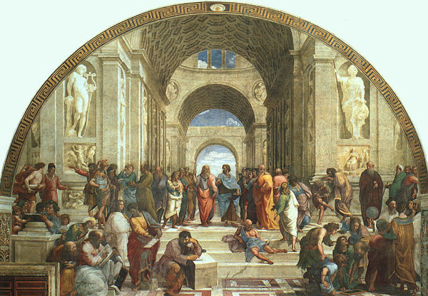
Here is an example of two visually “similar” artifacts, according to the
raw database logs:
The number of icon-artifact associations for this pair was distributed like
this:
|

|

|

|

|

|

|

|

|
|
| Raphael, School of Athens
|
8 |
5 |
1 |
1 |
0 |
1 |
1 |
1 |
18 |
| Molle, Dean Hammer
|
7 |
2 |
2 |
1 |
1 |
0 |
0 |
0 |
13 |
|
15 |
7 |
3 |
2 |
1 |
1 |
1 |
1 |
31 |
The number of co-occurrences computed for these artifacts was 69. The
distribution of icons shows that the Raphael painting has been tagged more
often. Normalization would have given a different ranking for this pair of
artifacts.
One Artifact and its Neighbors
Another approach to the inspection of the transaction database is to take one
artifact and calculate what in Last.fm terms would be referred to as its
neighbors.
[21] We did just that for the
Raphael painting presented above (tag frequency: 18). Keeping one value in the
comparison constant understandably reduces the effect of weighting. In the top
rankings calculated only two pairs of artifacts changed position after
weighting.
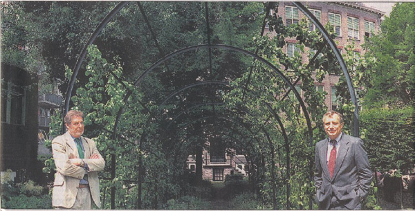
Again our sample resulted in rather obvious combinations of artifacts. The look
of the Raphael painting is strongly determined by the arch across the full
width of the painting, which is reflected in a succession of smaller arches in
the axis of the picture plane. More than half of the neighbors displayed such
arch-like shapes. Another salient feature of the calculated neighbors is
precisely this repetitive quality of shapes containing shapes. Here is an
illustrative example of an artifact that co-occurred with the School of
Athens:
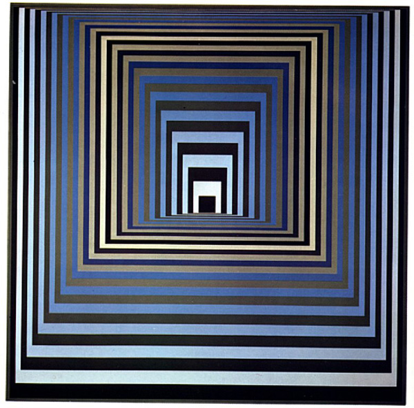
This association may at first surprise us, but nevertheless the diagrammatic
similarity is apparent. If we look up the corresponding distribution of
icon-artifact associations it appears that the high similarity score is
completely dependent on the shared icon of two congruent rectangles, connected
at the corners by four straight converging lines.
|
|
… |
|
| Raphael, School of Athens
|
5 |
|
18 |
| Vasarely, Vonal-Ksz.
|
8 |
… |
33 |
|
13 |
… |
51 |
Please note that the Vasarely painting has been denoted by a relatively large
number of icons not shared by the Raphael piece. Somehow the icons
any two artifacts do not share should be weighed in a formal
definition of similarity. In the next paragraph I will momentarily alter the
focus of my analysis and discuss an equation in which both the number and
distribution of shared icons and the icons not shared are
considered.
A Formula Describing a Similarity Measure for Pairs of Artifacts
The discussion above was based on an overall analysis of a co-occurrence table
and crude distance measures taking the number of shared icons into account.
Another approach to similarity measurement is taking any pair of artifacts to
compare the corresponding patterns of icon-artifact assignments. If two
artifacts share an icon this must add to the overall similarity value. The more
icons two artifacts have in common, the more the similarity value should
increase. Conversely icons not shared (but used for one of the artifacts in the
comparison) should diminish the overall similarity measure. Furthermore the
ratio of co-occurrences must also be taken into account. This amounts to
weighting the straightforward numbers: if both artifacts in a comparison have
an equal number of one particular icon in common, the weight of the
corresponding part in the equation could be multiplied by 1 (n:n); if one of
the artifacts has been tagged twice as much, the equation could be multiplied
by 1/2 (n:2n) and so on. (Of course the numbers must be weighted to optimize
results. See below.) So the similarity (ο) might be expressed in the following
descriptive formula: $$o=(( \sum_{1}^{n}
(\theta _n/N*s/l)- \sum_{1}^{m} \alpha_m/N)+1)/2$$
Here n is the number of shared icons, θ is (per icon shared by both artifacts)
the total number of occurrences, s is the minimum and l is the maximum number
of occurrences for each icon. The number of icons not shared (per artifact) is
m. The number (per icon) of icons not shared by both artifacts is α. N is the
sum total of occurrences of icons assigned to both artifacts. As a result of
this: if two artifacts do not share any icon, the similarity equals to 0.
Applying the formula to the (non-normalized) data for the artifacts of figures
6 and 7 this is the outcome: $$o =
((15/31*7/8+7/31*2/5+3/31*1/2+2/31*1/1-4/31)+1)/2 = 0.7488$$
For the artifacts in figures 8 and 9 before normalization o would
become: $$o =
((26/41*11/15+3/41*1/2-12/41)+1)/2 = 0.6045$$
Because in the formula s/l is the ratio of the smallest and largest number (per
pair of artifacts) the effect of applying the formula to non-normalized data
will lead to a pronounced bias. Obviously normalization is a necessary step in
preprocessing the raw data if we use the formula.
[22]
Fake Similarities
Up to now we have focused on similarity measures that become understandable if
we empirically compare the associated icons and artifacts. In the sample data
however there are indications of problems caused by the ambiguity of visual
tags (icons). Here is an extract of the (normalized) artifact x artifact
co-occurrence table, showing only 5 artifacts that were tagged exactly 24
times.
|
S18500 |
S23715 |
S75116 |
S75122 |
S75308 |
|
| S18500 |
137 |
|
|
|
|
137 |
| S23715 |
|
25 |
48 |
10 |
|
83 |
| S75116 |
|
|
64 |
1 |
|
65 |
| S75122 |
|
|
|
41 |
|
41 |
| S75308 |
|
|
|
|
92 |
92 |
| |
|
|
|
|
|
418 |
In the row and column headings we have the IDs of the five artifacts, while in
the table cells there are eight co-occurrence values, five of them being values
indicating the number of times an artifact co-occurred with itself. (We will
get back to this in the next paragraph.) The three remaining values express
co-occurrences of different artifacts. E.g. S75116 and S23715
refer to waterscape paintings by Claude Monet. The association (n=48) visually
makes sense. The other values seem to suggest a similarity between another
artifact (S75122) and the two Monet paintings. On closer consideration,
however, the icon responsible for the co-occurrence scores appears to have been
selected for its bluish appearance in case of the Monet waterscapes, and for
its sophisticated color gradients and peculiar configuration of rectilinear
lines in case of the other artifact: a painting from the series Homage to the Square: Apparition (1959), by Josef
Albers. In fact the co-occurrence is an “artifact of the
method”. Here is the icon responsible for the confusion:
This must be taken as a warning. Apart from the vocabulary bias
mentioned earlier, ambiguities in the vocabulary in use — our 100 icons — may
cause “fake similarities”. I will refer to this as vocabulary
ambiguity. (In a section below the inverse of this problem will be
discussed, viz. the confusion caused by partly redundant visual tags.)
Measures Qualifying Individual Artifacts and/or Visual Tags
Doubts about the appropriateness of the particular set of icons used in the
experiment forced me to take a closer look at the numbers associated with
individual artifacts. Again the objective is to verify empirically what numbers
in the co-occurrence tables stand for. And again the analysis was done on the
top 100 subset in terms of co-occurrences. This time however the values in the
pivot table were normalized. Artifacts were ordered according to the total
number of co-occurrences, the number of “self co-occurrences” (a multiple
of the number of times an artifact was tagged with one or more icons — see
above), and the number of co-occurring artifacts (per artifact). Maximum and
minimum values, and average, mode and median were also computed.
Data point out that the number of co-occurrences roughly co-varies with the
number of self co-occurrences. The same is true if we first subtract the number
of self co-occurrences from the number of co-occurrences. But unfortunately
this finding will not bring us near a paradigm shift.
More interesting was the outcome that the number of self co-occurrences for a
particular artifact negatively co-varied with the number of artifacts
associated with that artifact (correlation coefficient: -0.6753)
[23]. In other words: the more often an icon (or small set of
icons) was assigned to an artifact (in relative terms) the less often that
particular artifact could be related to other artifacts. All the same the
number of co-occurrences with these few artifacts tended to be high. Another
paraphrase of this could be: the smaller the number of partial similarities,
the more an artifact “approaches to” one of the icons used. It is clear
that this qualifies both artifact and icon (set). The implication of these
findings would be that a mere (automatic) analysis of transaction data can be
used to improve the set of icons. (See below.)
If we have a look at the top 10 of artifacts scoring high on “self
co-occurrence”, we might discern two broad classes of objects: artifacts
that are schematic (or: diagrammatic) in appearance, and “rich”
(non-schematic) artifacts that have one conspicuous formal feature. Because
subjects were asked to “check out the icon that you think matches any
singular outstanding visual characteristic of the piece most of
all available icons” the conspicuous traits must have been magnified.
Given the present set of icons this appeared to be a painting difficult to
“describe” unambiguously:
Several icons seem to have been chosen to indicate the colorfulness of the
painting: both the variety of colors and the striking yellow and purple image
regions. Others presumably refer to the composition of the picture in three
horizontal planes and/or the use of diagonals, the irregular size and shape of
color regions. Still others, according to my interpretation, are intended to
denote the complementary color contrasts and the “painterliness” of the
surface. Anyway it is evident that subjects in the Art.Similarities experiment were not unanimous in using the visual
diagrams offered to tag the Gauguin painting.
The interpretation of data so far suggests looking at a few other summaries.
From the full artifacts x icons table were extracted (per icon) the maximum
number of times it was assigned to any artifact. If we divide this maximum
value by the grand total for a specific icon, we might have a rough measure of
the efficacy of the icon. Values ranged from 0.05 (low efficacy) to 0.5 (high
efficacy). According to this approach the most and least “problematic”
icons in the set (if we skip very low grand totals — say below 25) are these:

|
where n=43; efficacy score=0.05 |

|
where n=40; efficacy score=0.48 |
Of course such numbers should be handled with care: maximum values could be
outliers. Perhaps other measures of central tendency (average, median) give
better results or could be used to arrive at conclusions that are more firm.
Falsifications
The empirical verification of similarity measures — number of co-occurrences,
similarity measure (o) — also made clear that some unmistakably similar
artifacts were not recognized as such. Here is a telling example:
The similarity of both images is striking, but they co-occurred only once. Why
is that so? If we review the available tags it appears that there is no single
icon fit to express the cross-shaped configuration that according to many is
the primary similarity feature here. One of the icons seems to be a candidate —
and it has indeed been related to the Carter photograph twice; it is a
representational black-and-white icon, displaying an umbrella depicted in
silhouette:
Perhaps the conceptual distance between an umbrella and a human figure
disqualified this icon.
[24] The fact that the Carter
photograph is a grayscale image, on the other hand, may have diminished this
conceptual distance. Other empirical findings seem to support the importance of
color in visual tagging. Half of the icons associated with the Boychuk picture
were dominantly orange colored; the color palette of eight out of ten was very
similar to the palette of the photograph.
[25]
Apart from the (cross-shaped) compositional features that both images have in
common, and the dominant color characteristics that — perhaps as a second most
conspicuous feature — set them apart, both artifacts apparently share another
formal trait, one that — in iconographical terms — may be described as a
silhouette. In the visual vocabulary of Art.Similarities there are quite a few icons that could be used to
denote this image characteristic, but most of these are in black-and-white and
show sharp outlines. That could be an explanation for the missing match in this
case. Both images show vague outlines (conspicuous similarity feature number
four). In fact there is one icon with the representation of a human figure,
which could be qualified as a silhouette, and it was used to tag the Boychuk
artifact. But it has an orangish background, which apparently disqualifies it
for the Carter photograph.
My rather lengthy discussion of this one falsification casus is intended to
introduce a few speculations about the promises of using visual tags. It makes
clear that successful tagging is dependent on a balanced set of visual tags
(icons). The size and the number of these visual tags are clearly decisive for
effective tagging. Furthermore the following principles should be taken into
account:
- Color phenomena may have a strong impact on efficient tagging.
- The presence of basic compositional features in the tag set is decisive.
- Representational elements may interfere with the tagging of formal
artifact characteristics.
And finally:
- Refined overall local features, as in the qualification “vagueness”
(of contour), will be hard to express unambiguously.
Observer Behavior
Even in the simple prototype application discussed here, it is possible to
retrieve all the image-icon assignments of one particular person. It is
fascinating to inspect the recorded visual discernments of individuals, because
they seem to give away observer habits. A sound follow-up procedure would be to
compare central tendencies in the discernments of several observers. The outcomes
can be stored in the database as performance data. If two observers
have made similar image-icon associations, then possibly they resemble one another
in the way their mental processes organize the visual world. What if one of these
individuals is recognized as an authority? Would that somehow qualify the other?
And if two qualified art historians agree on what is typical of a series of
artifacts, would that be the beginning of “proof”?
I made the point earlier, and I shall make it again, that the random presentation
of artifacts in this experiment must have affected similarity scores. Another
restriction is that subjects (n=204) were free to tag images. The top tagger
assigned icons 141 times and 19 subjects only tagged once. Obviously absolute
pronouncements based on these figures cannot be made. This is all the more true
where as to the dimension of subject characteristics — prior knowledge,
professional merits, age, race, etc. — an empirical verification of analysis
outcomes would have implied a more extensive survey. This was beyond the ambitions
of the current experiment.
So the dataset in this experiment is too restricted to justify a thorough analysis
of the behavior of subjects. With 400 artifacts and 100 icons we have 40.000
possible combinations. In the database only 2242 combinations occurred on a total
of 3918 records, giving an average of less than 2 hits per combination. It is
clear that few co-occurrence scores can be computed from these numbers. After the
grouping of observers by artifact-icon combinations I calculated 5317
co-occurrences for all subjects, the highest number being 15. In principle such
numbers can be used to compute similar observers, but given the restricted data I
will not elaborate on these data now.
Inspecting the voter x voter pivot table I noticed one peculiar phenomenon: the
rows and columns of some subjects displayed a striking low number of co-occurrence
scores. This appeared to be independent of the number of tags assigned by these
subjects. What could be the cause of these outliers? One explanation is that the
outliers correspond to subjects noticing visual subtleties that remain hidden for
other observers. Another, I think more plausible explanation is that the outliers
were caused by “clumsy” individuals, unable to make up their mind about the
most outstanding visual characteristics of the artifacts on display,
or even worse maybe, by subjects unable to understand the task at hand.
One might expect a correlation between the number of co-occurrences and the number
of unique icon-artifact assignments. For a sample of 10 subjects in the middle
range of tag frequencies (n=41–63) I computed for each individual in the
transaction table the ratio of the number of tags assigned and the number of
unique icon-artifact assignments. For obvious reasons there was a strong
correlation with the ratio of the sum of all co-occurrence values and the number
of co-occurrence values (r=0.94).
A quick-and-dirty reality check pointed out that my outliers were caused by
students with rather feeble study results, whereas — conversely — a highly
successful student was responsible for the top score. Especially the latter
finding seems to suggest that a good student in art history is able to discern
visual features that are in conformity with the discernments of his or her peers.
Of course we must be very careful with generalizations of this kind. It would be
more profitable to search for correlations related to an individual's preferences
on dimensions like: time period, geographical location, or even iconographical
subjects.
Icon Covariance
In my experiment the selection of icons was non-arbitrary.
[26] In fact a priori visual knowledge was used to
compile an effective (i.e. varied) set of icons, starting from a base collection
of about 500 diagrams. There is a drawback to this non-evolutionary approach. The
process may become biased. I may have unknowingly excluded options for expressing
specific visual concepts. And indeed, the discussion of falsifications in the
previous section gave an example of such a probable omission. I will now consider
the opposite phenomenon, viz.
vocabulary redundancy, which is here
defined as a lack of efficacy in the icon set due to the existence of icons that
are apparently used to denote same or almost same visual concepts.
[27]
The assumption is that icons appropriate to refer to a specific visual feature
will co-occur more often than may be expected in the case of purely disjointed
icons. Of course there is the risk that the set of artifacts used in this
experiment displays a few “real world” conjunctions — as a matter of fact I
have an example of that below. Therefore I repeat that my data analysis can only
be indicative. Nevertheless I think that from the results of the present
experiment some generalizations can be made.
This time in the original transaction table I grouped the icons that had been
assigned to each individual artifact. For the resulting subsets of icons
co-occurrences were computed. The sum of all possible pairs is (100
2+100)/2=5050, since we have 100 icons and since
co-occurrences of same icons are relevant as well. In the transaction database
3137 unique combinations occurred. Only 7 icons were never assigned more than once
to a particular artifact.
[28] The sum total of icon pairs in our database was
24.826. So the average number of co-occurrences — if we skip the zero-values — is
about 8. Here is the top 5 of pairs of icons in terms of co-occurrences:
| Icon pairs |
Co-occurrences |
and 
|
204 |
 and and 
|
136 |
 and and 
|
119 |
and 
|
116 |
and 
|
114 |
This way of visualizing co-occurrences may create the impression that redundancies
in our vocabulary indeed exist. The fact that mere numbers seem to indicate an
overlap in the visual features of a set of schematic images is captivating. None
of our subjects ever alleged this! So could the manipulation of visual things by
individuals amount to some sort of collaborative visual knowledge, a knowledge
that emerges from our transaction database?
Just to check on this I zoomed in on co-occurrences for the pair of icons for
which n=114. Here are the results:
|
|
|

|

|

|

|
|

|

|

|
|
|
119 |
114 |
89 |
46 |
29 |
26 |
20 |
19 |
18 |
16 |
|
|
|
|
|
|
|

|
|

|
|
|
|
114 |
84 |
29 |
23 |
21 |
17 |
13 |
13 |
13 |
12 |
In this particular experiment we must be cautious: the relatively small number of
objects in the database could affect the number of co-occurrences computed. As a
matter of fact there are two possible causes of high frequencies for
co-occurrences:
- Icons in the tag set are visually similar. (I would suggest they are
redundant.)
- A particular combination of visual characteristics is prevailing in the
artifacts considered.
It is tempting to forget about the reality these icons refer to, and to read each
table as a summary of the alternative interpretations of the icons on the left. On
the other hand, the more the co-occurring icons classify the icon on the left, the
more redundancy we presumably have in the set. Furthermore I expect that the
similarity between the icon being analyzed and the co-occurring icons diminishes
from left to right. In the table just above the first icon in the row — the one
with the spokes — is ostensibly similar to the icon of our focus. The appearance
of a green-and-blue icon however is less obvious in an immediate comparison. An
empirical check gives away that the co-occurrence value here is caused by pictures
of landscapes with an easily tractable vanishing point and guidelines.
Unfortunately I have no data at hand to support this line of thought. Still I
think it is safe to say that the mere number of co-occurrences with other icons in
the tagging set suggests that the icons are partly redundant indeed.
[29] Knowledge of this kind can be used to improve the (initial)
set of icons. What than could be a rule for detecting redundancies in the set of
icons? I think such a rule should both consider the number of co-occurrences and
the number and distribution of other icons in the neighborhood of the icons
compared, e.g.:
If two icons are in the top n of co-occurrences, and the top n of
co-occurrences for these icons is composed of the same icons, than the icons
are at least partly redundant and a “merge operation” to get rid of the
redundancy is justified.
The challenge for future research is to make such rules for an automated analysis
explicit.
Conclusions
As was contended in the Introduction, advocates of humanities computing stressed the
fact that computational techniques may have the collateral benefit of indicating
where in the domain of scholarly research “there are holes in your sketch, [and]
where it breaks down”
[
Unsworth 2001]. Add to this that in the humanities the process of fine tuning personal
interests and cognitive schemata is paramount. There are few if any final answers as
to meaning in the visual arts: “the process is often at least as
important as the product, and the process itself produces new knowledge and
understanding”
[
Jörgensen 1999, 315]. That is exactly why I have good hopes that applications like
Art.Similarities will be beneficial in art/art history
education. More in general I think that the experiment has demonstrated that Web 2.0
technologies can offer new opportunities in humanities research.
From the analysis section we learned:
- that meaningful perspectives on visual artifacts can be pointed out by
visual means;
- that useful similarity measures can be derived from multiple (simple)
similarity expressions;
- that the composition of efficient visual vocabularies may benefit from
visual tagging.
Stock-taking here was primarily aimed at indicating the essential possibilities of a
visual labeling and harvesting paradigm for art historically relevant visual traits.
But our field test also indicated some limitations of visual labeling. Color is
problematic; the size of our displays units is (still) limiting; the power to
differentiate between stylistically similar works of art is still indeterminate; we
have no sharp idea of what an ideal set of visual denotats may look like; we don't
know in what degree such a set could be universal. Nevertheless Art.Similarities also suggested possible directions for future
research.
One drawback of collaborative filtering systems is their tendency not to cover the
extreme cases [
Chen & McCleod 2005], [
Sierra 2007]. This issue also
came up with the visual voting system proposed here. How can we direct the system to
encode the significance of valuable exceptions to the rule, and how can we make it
ignore cheating, trivialities and clichés? Some data mining protocol for judging
automatically traced deviant votes (outliers) and blowing up or playing down their
relative importance would be a valuable extension to
Art.Similarities.
[30]
Another extension would be the coordination of different solutions to the retrieval
of information about same object types. This paper offered rough sketches of a method
of classifying visual artifacts independently of other classifying options. But the
interdependency of different classification systems is worth considering.
Iconographical descriptions (“aboutness”) and descriptions of visual qualities
(“offness”) belong to separate notational spheres [
Panofsky 1970], [
Bätschmann 1986], [
Nauta 1993], [
Shatford Layne 2002]. Still there is an apparent covariance of these
description options: if two artifacts are depictions of a particular theme, chances
are that both artifacts share a considerable number of visual characteristics. Such
partial description parallels also exist for other types of metadata. For example:
once an object has been classified as an “engraving” (qua technique), it is
usually redundant to file the artifact as a “grayscale” picture, or as a picture
“having linear qualities”. So we could fine tune the current approach by
introducing restrictions: if images are in grayscale, don't offer colored icons, and
vice versa. Eventually this may lead to the use of exchangeable icon sets, and the
related question of how to select these sets of visual icons.
Conventional scholarly communication in art history amounts to a textual exchange of
information in perhaps 95% of the cases. With that in mind the idea might come up
that somehow the results of visual voting actions should be translated back into
textual arguments. Now how will we ever get back to words? Since today's information
technology is truly interactive in nature, conclusions based on coordinated visual
discernments can be immediately communicated back to the communities involved in the
process. One group of observers could be involved in visual voting, while the results
from this “subroutine” may be fed back to another part — say the “Next
Level” users — of the population. If the second group uses some sort of verbal
labeling interface, like the one developed by the Steve.museum initiative [
Wyman et al. 2006], promising cross-fertilizations become possible. With the
adoption of appropriate standards, an integration of textual annotations, reviews, or
the discussion of remarkable patterns in visual behavior becomes possible. In a way
the collaborative visual filtering system enables noticing, labeling and re-labeling
phenomena, thus giving shape to an augmented social construction of knowledge [
Barrett 1989]. The role of a scholar in designing these filtering
systems will not be the role of an author of scholarly articles or monographs, but
the role of a broker in art historical knowledge, the director of an intricate
process of knowledge mediation [
Stubenrauch 1993].
If it is assumed that there is no reason to strive for a one-fits-all collection of
visual denotats, extended research might be focused on the matching of specific
collections of visual artifacts and appropriate sets of icons. Such research efforts
could start from the assumption that when the medium of expression is fixed,
observers (experts and/or lay people) will just express themselves in the reference
materials at hand, focusing in these denotats on what are their peculiar points for
attention. This actually simplifies research, since developers need not be explicit
about suitable reference options. A myriad of further extensions to the basic visual
voting model is now conceivable. Observers from particular user groups, for instance,
might be enabled to work with sets of dedicated icons (“private
alphabets”). We predict that as a matter of course these series will be
composed according to common sense principles, like maximum diversity, sufficient
coverage, etc.
Extensions of the voting system may include additional functionalities. One might be
the possibility to define subsets of artifacts, based on singular or multiple
corresponding artifact-icon associations; these subsets would thus be true
collaborative products. Based on an analysis of patterns in voting behavior (or,
alternatively, explicit observer profiles), the system could also gradually evolve
into a system displaying only the preferences (both artifacts and/or votes) of a
particular user group. Finally, since somehow artifacts co-organize icons, the labels
(icons) in the interface may be grouped (i.e. organized) by their co-occurence
patterns; perhaps these may be taken as so-called
emergent semantics
[
Aberer et al. 2004].
Hopefully this orientation has made clear that the social formation of opinions
concerning the visual similarity of cultural artifacts amongst a group of motivated
observers can with the use of information technology be modeled and
recorded without the application of verbal descriptors, and that
interesting data processing options exist for collaboratively and visually
characterized artifacts. This offers many starting points for further research.
Notes
[3] A question indicative of
ever shifting intellectual property concerns is whether surreptitious measurements
of user behavior should be considered a breach of copyright laws. That someone's
purchasing behavior is a creative act may be defendable.
[4]
The value of such an exercise could be in testing the methods of the field
under consideration. Advocates of humanities computing like John Unsworth have
stressed the fact that computational techniques may have the collateral benefit
of indicating where are methodological flaws in scholarly research:
“The implementation of a spec
in a program appears as a kind of critique of the text of the
spec” — which is to say, when you sketch what you think you
understand, and then try to turn that sketch into a series of
instructions a computer can execute, you find out where there are holes
in your sketch, where it breaks down. Similarly, when you design an
information structure and then try to fit the actual information into it,
you find out where the structure doesn’t fit. That’s the back and forth
between part and whole, rule and instance.
[Unsworth 2001]
[5] For a comprehensive project on collaborative
verbal tagging (in the context of museum information systems),
refer to the Steve.museum project.
Cf. [Bearman & Trant 2005] and [Wyman et al. 2006]. See also [Ross et al. 2004, 145–179] for contextual materials. A more general
verbal tagging application, much discussed, is Google Image
Labeler, based on the work of Luis von Ahn. Cf. [O'Reilly 2006]. [7] Here the word
“effective” is used in the sense of “being able to get at the record”
[Bush 1945], which is a modest objective. One of the rare attempts
to communicate in a systematic way about certain (compositional) features of works
of art is Erle Loran's controversial book on Cézanne's composition [Loran 2006]. Loran developed a diagrammatic language to point at
organizational principles in the paintings of Cézanne. His diagrams, however, are
fairly dependent on the oeuvre being studied. For the present experiment they are
not sufficiently simple. It is my aim to use more “attenuated” diagrammatic
images in order to communicate less specific image characteristics. [8] In a sense this is a loose generalization of what as early as 1950 was
concluded by Fred Attneave after a series of experiments using simple visual
stimuli [Attneave 1950]. Attneave's findings initiated a prolific
line of research in the domain of cognitive psychology and computer vision. [9] Some support for this
assumption I found in Jörgensen [Jörgensen 1999, 305]. [10] Russel A. Kirsch defined these as “intermediate sources”
[Kirsch 1984]. [11] A visual denotat is defined here as an actual
feature or formal characteristic of a visual artifact, which an observer regards
as meaningful and communicable, and which may be referred to by a visual
abstraction of that feature. It may be contrasted with the connotat,
which is any emotional or otherwise associative response to an artifact which,
though meaningful privately, cannot be meaningfully communicated in abstractable
visual form.
[12] Consider this as a special type of
visual similarity, where one image is replete and the other
simple (or, as Goodman worded it, attenuated). The
relationship is unbalanced. The simple image might be said to
clarify one trait in the replete image, acting this way as a
visual denominator. Cf. [Goodman 1988]. See note 14 in this article. [13] It might be objected that even a
simple (iconic) image may be (visually) ambiguous, up to the point where the
nature of its similarity to a replete visual artifact becomes obscure. This
objection is refutable by proposing that whenever associations are ambiguous it is
the presentation context that will determine the probability of
specific readings. Compare this to the ambiguity of a word like “Bank”, where
“Bank” + “of England” <> “Bank” + “under
water”.
[14]
“Replete” is the word used by
Nelson Goodman to indicate that (in certain images, particularly works of art)
every namable trait is or may be decisive for the overall aesthetic effect. The
opposite of “replete” in
Goodman's vocabulary is “attenuated”
[Goodman 1988, 230n]. The concept is used here to
distinguish full, rich, multi-trait artifacts from simple (attenuated) icons.
See also [Elkins 1999, 70]. [15] Subsequent research may lead to
systems where another type of object is involved, viz. the textual
argumentation of individuals, worded ad hoc or in the manner of
familiar ontologies.
[16] In future systems additional attributes can be added in
separate tables to record various kinds of performance
data.
[17] Here are two examples of additional attributes of votes that
might or even should be incorporated in future versions of the system.
First, normalized picture coordinates: these might be stored to record
regions of interest in cases where outstanding features are distinctly
localized. And second, the kind of task involved: asking an observer to
indicate what is the most salient image characteristic will lead to a very
different significance of voting behavior results as compared to asking for
giving votes to some trivial or even any image feature.
[18] An exhaustive discussion of data dictionaries falls outside the
scope of this paper.
[19] The
inclusion of choice pairs of replete images sharing some apparent visual
configuration was considered, e.g. two highly symmetrical images, two images
pronounced to be similar according to a widely respected art historian, or even
two copies of the same work. The only “testers” actually included are a
pair of almost identical artifact reproductions — a painting by Seurat (Bathers at Asnières, 1883) and a preparatory sketch of
the same piece (Final Study for “Bathers at Asnières”
, 1883), and two similar images from a textbook on pictorial concepts
[Jenny 2000, 98–99]. It is a quick-and-dirty setup to see
if these image pairs would be indexed in a predictable manner. They
were. [20]
“Eye-catching”, to put it plainly, implies a response of contemporary
observers. The historicity of my approach will be discussed in a separate
publication.
[22] Following this adaption
the similarity measure for figures 6 and 7 would become: 0.7319 (a slight
decrease in value). For figures 8 and 9 o after normalization would be:
0.5832 (also a slight decrease).
[23] Compare
this to the correlation coefficient for the sum of “non-self”
co-occurrences and the number of associated artifacts, which is
-0.1504.
[24] Time and again I found that as soon as pictures
could be perceived as depictions, the objective of tagging formal image
characteristics was not fulfilled.
[25] I compared histogram values of
the Boychuk picture and all of the associated icons taken together: mean and
median for the hue channel were exactly the same: mean=23, median=22.
[26] Starting from the
premise that the actual manipulation of indexing terms would take
a meaningful form, reflecting visual habits/knowledge in the observer group,
the initial plan was to supply the community with a set of random
visual signs. From an analysis of the icon use logs, after a substantial amount
of time, would emerge traces of visual thinking. The whole process might be
made evolutionary. Some icons might be used too often, reducing informational
value; some might never be used at all; some icons might tend to appear
together in most of the cases. There might be pairs of icons co-appearing with
another icon, where the latter one could be taken as a merge (component) icon
of both the others, and so on. The initial set of icons might be restricted or
extended based upon results from the analysis. This way the effectiveness of
the visual vocabulary in use would be improved, while the relevant visual
notions could surface.
[27]
Vocabulary bias and vocabulary ambiguity were
considered in an earlier section of this paper.
[28] Notwithstanding the fact that our sample is
modest, I assume that a relatively low number of self co-occurrences may also
count as a crude measure of icon efficacy. Compare this to the earlier
paragraph on icon efficacy. If we take the ratio of the number of times an icon
co-occurred with itself and the frequency of that same icon as a measure of
efficacy, the icons in our earlier example become 0.16 (for the “golden
glow” icon) and 4.45 (for the “low horizon” icon) on a scale ranging
from 0.07 to 6.86.
[29] The
differences in both sets of co-occurring icons on the other
hand are informative as well. The vortex-like shape having a high co-occurrence
value in the upper table does not show up in the lower table, and in the lower
table we have a checker board which would be visually unsound in the upper
table. These differences are immediate qualifications of the icons being
compared.
[30] For Art.Similarities
work in progress is focused on “detecting Level 2” observers and approval
recording. Refer to steps 16–18 from the experimental setup. See also Luis von
Ahn's “games with a purpose”
[Ahn 2006]. Works Cited
Aberer et al. 2004
Aberer, Karl, Philippe Cudré-Maroux, and
Aris M. Ouksel, eds. “Emergent Semantics
Principles and Issues.”
IFIP 2.6 Working Group on Data Semantics: Research Group of Distributed
Information Systems (SID), University of Zaragoza, 2004.
Online version at
http://sid.cps.unizar.es/PUBLICATIONS/POSTSCRIPTS/dasfaa04.pdf.
Attneave 1950
Attneave, Fred. “Dimensions of
similarity.”
American Journal of Psychology 63.4 (1950):
516–556.
Barrett 1989
Barrett, Edward. “Introduction: Thought and
Language in a Virtual Environment.” In The Society of
Text: Hypertext, Hypermedia, and the Social Construction of Information,
edited by Edward Barrett. Cambridge, MA:
The MIT Press, 1989.
Bearman & Trant 2005
Bearman, David, and Jennifer Trant. “Social Terminology Enhancement through Vernacular Engagement:
Exploring Collaborative Annotation to Encourage Interaction with Museum
Collections.”
D-Lib Magazine 11.9 (2005). Online version
at
http://www.dlib.org/dlib/september05/bearman/09bearman.html.
Bra & Neijdl 2004
Bra, Paul de, and Wolfgang Neijdl, eds.
Adaptive Hypermedia and Adaptive Web-Based Systems. Vol.
3137,
Lecture Notes in Computer Science.
Berlin: Springer, 2004.
Online version at
http://www.springerlink.com/content/r21696v81c2a/.
Bätschmann 1986
Bätschmann, Oskar. Einführung in die
kunstgeschichtliche Hermeneutik: Die Auslegung von Bildern.
Darmstadt: Wissenschaftliche
Buchgesellschaft, 1986.
Chen & McCleod 2005
Chen, Anne Yun-An, and Dennis McCleod. “Collaborative Filtering for Information Recommendation
Systems.” In
Encyclopedia of Data Warehousing and
Mining. Idea Group, 2005. Online
version at
http://imsc-dmim.usc.edu/publications/121new.pdf.
Eakins & Graham 1999
Eakins, John P., and Margaret E. Graham. “Content-based Image Retrieval: A report to the JISC Technology
Applications Programme.”
Newcastle: Institute for Image Data
Research, University of Northumbria at Newcastle,
1999.
Elkins 1999
Elkins, James. The Domain of Images.
Ithaca and London: Cornell University
Press, 1999.
Finch 1974
Finch, Margaret. Style in Art History.
Metuchen, NJ: Scarecrow Press,
1974.
Goodman 1988
Goodman, Nelson. Languages of Art.
Indianapolis: Hackett Publishing
Company, 1988.
Huijsmans & Smeulders 1999
Huijsmans, Dionysius P., and Arnold Smeulders, eds.
Visual Information and Information Systems: Third
International Conference, Visual'99, Amsterdam, The Netherlands, June 1999
(Proceedings). Vol. 1614, Lecture Notes in Computer
Science. Berlin: Springer,
1999.
Hutchins 1995
Hutchins, Edwin. Cognition in the Wild.
Cambridge, MA: The MIT Press,
1995.
Jenny 2000
Jenny, Peter. Bildkonzepte: das wohlgeordnete
Durcheinander. Mainz: Verlag Hermann
Schmidt, 2000.
Kirsch 1984
Kirsch, Russell A. “Making Art Historical
Sources Visible to Computers: Pictures as Primary Sources for Computer-based Art
History Data.” Paper presented at the Automatic Processing of Art History
Data and Documents, Firenze
1984.
Loran 2006
Loran, Erle. Cézanne's Composition: Analysis of
His Form with Diagrams and Photographs of His Motifs. Berkeley
and Los Angeles: University of California Press,
2006.
Panofsky 1970
Panofsky, Erwin. “Iconography and Iconology: An
Introduction to the Study of Renaissance Art.” In Meaning in the Visual Arts, 51–81. Harmondsworth:
Penguin Books, 1970.
Salomon 1996
Salomon, Gavrie. Distributed Cognitions:
Psychological and Educational Considerations, Learning in Doing: Social, Cognitive
and Computational Perspectives.
Cambridge: Cambridge University Press,
1996.
Santini et al. 2001
Santini, Simone, Amarnath Gupta, and Ramesh
Jain. “Emergent Semantics Through Interaction in
Image Databases.”
IEEE Transactions on Knowledge and Data Engineering 13.3
(2001): 337–351. Online version at
http://www.sdsc.edu/~gupta/publications/kde-sp-01.pdf.
Stubenrauch 1993
Stubenrauch, Robert, Frank Kappe, and Keith
Andrews. “Large Hypermedia Systems: The End of the
Authoring Era.” Paper presented at the Educational Multimedia and
Hypermedia Annual, Orlando, Florida, June 23–26,
1993.
Tufte 1998
Tufte, Edward Rolf. Visual Explanations: Images
and Quantities, Evidence and Narrative. Cheshire, CT:
Graphics Press, 1998.
Unsworth 2001
Unsworth, John. “Knowledge Representation in
Humanities Computing.” In
Lecture I in the
eHumanities: NEH Lecture Series on Technology and the Humanities.
Washington, DC, 2001. Online version at
http://www.iath.virginia.edu/~jmu2m/KR/KRinHC.html.
Vygotsky 1976
Vygotsky, Lev. Mind in Society: The Development
of Higher Psychological Processes. Cambridge, MA:
Harvard University Press, 1976.
Wenger et al. 2002
Wenger, Etienne, Richard McDermott, and
William M. Snyder. Cultivating Communities
of Practice. Boston, MA: Harvard Business
School Press, 2002.
Wyman et al. 2006
Wyman, Bruce, Susan Chun, Rich
Cherry, Doug Hiwiller, and Jennifer
Trant. “Steve.museum: An Ongoing Experiment in Social
Tagging, Folksonomy, and Museums.” In
Papers Museums
and the Web 2006. Pittsburgh: Archives and
Museum Informatics, 2006. Online version at
http://www.archimuse.com/mw2006/papers/wyman/wyman.html.
Wölfflin 1950
Wölfflin, Heinrich. Principles of Art History:
The Problem of the Development of Style in Later Art. Unabridged and
unaltered republication of the Hottinger translation of Kunstgeschichtliche Grundbegriffe, originally published in 1932 by G.
Bell and Sons, Ltd. ed. Mineola, NY:
Dover, 1950.