Abstract
Many tools can produce maps, graphs, and charts that may differ in seemingly minor
ways. Data visualization tools are one type of “middleware” that can be all but forgotten when one is presented with final
products such as papers and presentations containing visualizations [Drucker and Svensson 2016]. Since the output of various software packages is
sometimes similar, it is easy to forget the assumptions that went into the diagram,
the dataset, and the software when looking at the final product — or even while using
the tool if one becomes sufficiently accustomed to the interface. In this review, I
revisit the visualization suite Palladio – which Miriam Posner has called a “Swiss Army knife for humanities data”
[Posner 2014] – and the many projects that have made use of Palladio’s
core features in the years since its launch. I examine the strengths and limitations
of Palladio, as a network and map-making tool for exploring data and for rapidly
prototyping diagrams, designed with an iterative process in mind. I contrast this
iterative mentality with the analytic sensibility of tools like Gephi and Cytoscape,
and review the primary features of Palladio with one primary case study (my own
visualizations of the French Enlightenment network) and examples of how the features
have been used in other digital humanities projects. Palladio is very useful for
qualitative studies of data that include geospatial and chronological dimensions,
especially when the data are tagged with different types of qualitative metadata, but
it also tends to impose a historical geographical view on the data by foregrounding
geospatial relationships, time, and other historical considerations.
Introduction
Data visualization is a complex process because creating a single visualization
requires an understanding of principles of design and mathematics, as well as the
content that is being visualized. For humanists, finding collaborators in data
science and design can be a practical and financial challenge. Fortunately, there are
some tools and tool sets which can aid with the design process and prototyping of
diagrams. In this tool review, I revisit Palladio [
Humanities + Design Lab 2014], a digital
humanities package developed in the Humanities + Design Lab at Stanford University in
a collaboration with the DensityDesign Lab in Milan. Palladio has now been available
for more than five years and has been used to visualize everything from the
appearances of “ladies orchestras” in Europe from 1870 to
1918 [
Koivisto 2019] to participants in Black Tech from 2014 to 2018
[
MikeR 2019]. I have surveyed as many projects using the tool as I
could find and will include examples of use cases and feedback on the tool from
projects worldwide.
Palladio is a tool for filtering data and quickly producing diagrams that display
data spatially and alongside temporal dimensions like timelines and timespans; it
lacks the network analytics of software packages built for mathematical analysis. The
online app allows for the presentation of multifaceted data, such as network data
with date ranges or categories like network type with location data. Palladio was
developed in the Humanities + Design Lab by Dan Edelstein, Nicole Coleman, Ethan
Jewett, Giorgio Caviglia, and others to fulfill partially the vision for “Knot,”
“an interface for the study of social networks in the
humanities”
[
Uboldi et al. 2013]. The Palladio tool suite lends itself to qualitative
studies because the visualizations that it produces (maps, network graphs, tables,
and galleries) are familiar to most humanists. Producing iterative versions of such
diagrams for the sake of quick comparison between them is a good way to explore
multifaceted data that have not been curated for one use or with one particular
hypothesis in mind — a collaborative research process which has been referred to as
“design thinking”
[
Ciuccarelli 2014]. As such, Palladio is a powerful tool for exploring
data and patterns qualitatively. Unlike many other network graph packages, like Gephi
[
Bastian et al. 2009], with which it shares some network graphing features,
Palladio does not have the capacity for network analytics and is limited in choices
such as graph layouts, which are not customizable in Palladio but are in Gephi.
Rather, Palladio presents an overall good fit for historical case studies. It is in
this respect that Palladio is a kind of “middleware” — in
the terms of Drucker and Svensson — or a software solution that makes important
design decisions for the user and makes some of these design decisions less apparent
to viewers of any resulting visualizations [
Drucker and Svensson 2016].
Palladio was developed for use by historians and those working in related disciplines
like area studies, art history, literary history, and media and cultural studies, in
which historical time and space are useful concepts. The discussions which led to the
creation of the tool followed a lab model: that is, “analyzing
best practices, employing design research methods, engaging in peer critiques,
involving usability testing and user evaluations, and further expanding the role
of infoVis to the content of service design and the trends of design for social
good”
[
Shen 2018, 22]. The lab model, which is collaborative and
open-ended, has frequently gone by the trendy name “design thinking” but is
really just an abstracted form of the design process, which, in the case of Palladio,
meant an ongoing collaboration between humanists and designers. The focus on ease of
use, combining types of diagrams, and quick prototyping came out of Mapping the
Republic of Letters [
Humanities + Design Lab 2019]
[
Edelstein et al. 2017], a large project of which many component projects are
historical, as well as a 2012 Humanities + Design Lab workshop that focused on the
visualization of time and networks, “Early Modern Time &
Networks.” While those activities did not share a single methodology or set
of research questions, they, for the most part, dealt with social networks in Early
Modern Europe and the Americas from 1500 to 1800. The diversity of research projects
presented a variety of use cases, from correspondence networks to travel itineraries
to galleries of individuals’ photos. The involvement of DensityDesign was decisive
for both the use of Mike Bostock’s d3.js library in visualizations and for the focus
on prototyping and flexibility of tools. Like DensityDesign’s other open source web
tool, RAWGraphs [
DensityDesign Lab 2013], Palladio provides “a
missing link between spreadsheet applications (e.g. Microsoft Excel, Apple
Numbers, OpenRefine) and vector graphics editors (e.g. Adobe Illustrator,
Inkscape, Sketch)”
[
DensityDesign Lab 2019]. Whereas Palladio generates mainly maps and network graphs,
RAWGraphs can produce a wide range of charts from box plots to scatterplots to
treemaps [
Mauri et al. 2017]. As Yvette Shen has observed, RAWGraphs “adopt[s] clean and crisp aesthetics” of modern graphic design
influenced by the Bauhaus School and the International Typographic Style with “geometric layout, orderly typography, effective use of white space,
and simple color composition”
[
Shen 2018, 6–7]. Palladio similarly makes use of a modern graphic
design style for both the interface and outputs.
Since historians often have set archives or pre-established datasets but do not
necessarily have preconceived ideas of what patterns they will find in the data,
priority was placed on the ability to rapidly prototype diagrams to see whether
interesting patterns appear, as well as the ability to filter data in order to look
at subsets. Simplicity of the interface allows for the quick creation of diagrams
that are highly legible in print format or as static images online; visualizations
can be exported as SVG files to be refined in vector graphics editors like Adobe
Illustrator or Inkscape. The maps and diagrams produced in Palladio are not
copyrighted and can be printed in commercial and non-commercial works, unlike maps
produced in Google Maps, for example. Palladio can also be used to produce tables and
galleries that allow individual records to be explored via filtering by categories,
timespans, and timelines. By moving between the maps/graphs and tables/galleries,
researchers can find patterns in the data and then identify which records are a part
of the patterns. Thus, the focus in using Palladio is on moving between diagrams and
between types of diagrams rather than drilling down on one type of visualization or
graph.
Features and Case Studies
In the interest of showing how this prototyping works and also explaining some of the
features of Palladio, I will walk through some examples of diagrams produced in
Palladio and discuss features like filtering that can be used to rapidly prototype
diagrams. I will also give examples from other projects and comments from other
researchers who have used each feature in their work. Since they are the most popular
features, I will focus most of my commentary on maps and network diagrams. Other
demos that review aspects of Palladio include
Posner
(2014) and Marten Düring’s review in the
Programming
Historian, where he concludes that it is “platform-independent and particularly easy-to-use”
[
Düring 2015]. Düring’s demo includes sample data and a thorough
discussion of how to structure network data for visualization in Palladio, which I
will not be able to treat here. The data used in my visualizations are correspondence
and demographic data from the Electronic Enlightenment Project and the Groupe
d’Alembert [
Comsa et al. 2014]. The metadata are enriched according to the
methods described in the article “The French Enlightenment
Network”
[
Comsa et al. 2016]. The French Enlightenment Network dataset is available
online in multiple formats, with examples of diagrams in various formats here:
http://bit.ly/VisualizingFEN. It is
worth knowing that the dataset is a list of individuals with basic demographic data
(name, birth and death places and years, nationality, gender, etc.) and also
placement into one or more networks such as “Letters_Philosophical” for writers
on philosophical subjects, and “Aristocracy” for members of the nobility.
First, a few words about setting up the software and creating a dataset. Palladio is
available as an installable software package or as a web tool; the web tool is
available at
http://hdlab.stanford.edu/palladio/. Either way, access is through a web
browser. The first step to creating a visualization is to select “Create
Project” and input data. There are several ways to input data into Palladio.
Data can be imported from a Google spreadsheet, a proprietary tablature file (TAB) or
the more common tab-separated values table (TSV) or comma-separated values table
(CSV), or copied and pasted from other applications like Microsoft Excel, Numbers,
TextWrangler, or TextEdit. Data that are pasted into the online form and uploaded are
then automatically recognized as text, numbers, dates, coordinates. If the data type
is not recognized or misrecognized, that can be corrected by clicking on the pencil
icon to open the data verification window and change the data type. Columns can be
hidden by clicking on the eye icon; if they are hidden, it will not be possible to
visualize the data in that column until the column is made visible again. The
filename and the name of the data table can be changed.
Within the data verification window, there is a preview of the data. There are two
more functions to be aware of: 1) splitting multiple values and 2) extending the data
table. Palladio supports multiple values, such as multiple tags for the same record;
for example, the city of Berlin could be tagged “German” and “Large city”
by creating a column for cities and a column for city characteristics; within the
“city characteristics” column would be “German;Large city” if the
delimiter were a semi-colon. Using multiple values in a cell is useful for
unstructured datasets where the rows and columns might be pre-determined but where
researchers might want the freedom to add values as the dataset is created. For
instance, most people might have one nationality, but a few might have more than one.
In this case, most cells would contain one value, like “American,” but the
nationality cell of a binational could contain two values, like
“American;Mexican,” that would be readable as separate values. The delimiter
(any character, often a comma or semi-colon) can be selected within the data
verification window; consecutive delimiters can be treated as one so that a comma and
a space are counted as one.
The second feature, extending the data table, is useful if the dataset contains more
than one table, or if the dataset has many repeated values which are consistently
associated with the same values. One use case is for LatLong coordinates; where the
primary dataset contains the same place multiple times, LatLong coordinates can be
associated with those places by extending the “Places” column with a data table
consisting of the “Places” as text and another column of coordinates. Similarly,
metadata about texts and their authors can be kept on separate spreadsheets and
combined within Palladio as long as there is one column in each data table that
matches the values in a column in the other table.
Once the dataset is imported and verified, the next step is to choose a type of
visualization. Not all visualizations work for all data types. Map View needs
coordinates. The Network Graph View needs at least two columns of data and should
only be used if there is a consistent logic of connection between these two columns.
Since Palladio doesn’t allow for much customization of graphs, the eventual product
will be a bipartite graph with two types of nodes or entities. The edges, or links,
cannot be weighted. The Gallery View requires images. Tables are very versatile and
work well with large datasets. For this reason, it is important to think about what
to do with Palladio before producing a dataset. Palladio is very flexible in
importing data, but once it is imported, extending the data table may be the only way
to add missing data types, and data cannot be edited within Palladio. I will now look
at how to produce the four kinds of diagrams and some notable features of each. Mark
Braude produced a very brief overview of features with screenshots [
Braude 2014]. A more technical overview of features is available in
Humanities + Design Lab (2014).
Two Kinds of Maps: Points Versus Point-to-Point
First, I will look at the Map View in Palladio. There are two map types: 1) maps with
points sized according to defined quantities, which are useful for displaying static
geographic information, and 2) point-to-point diagrams, which are more useful for
showing movement or change over time. Maps can be used to compare the weight, or
influence, of cities, as well as travel and communication between cities and other
geographical points. The data for both of these map types can be filtered to show a
subset of the data, according to categories chosen by the user.
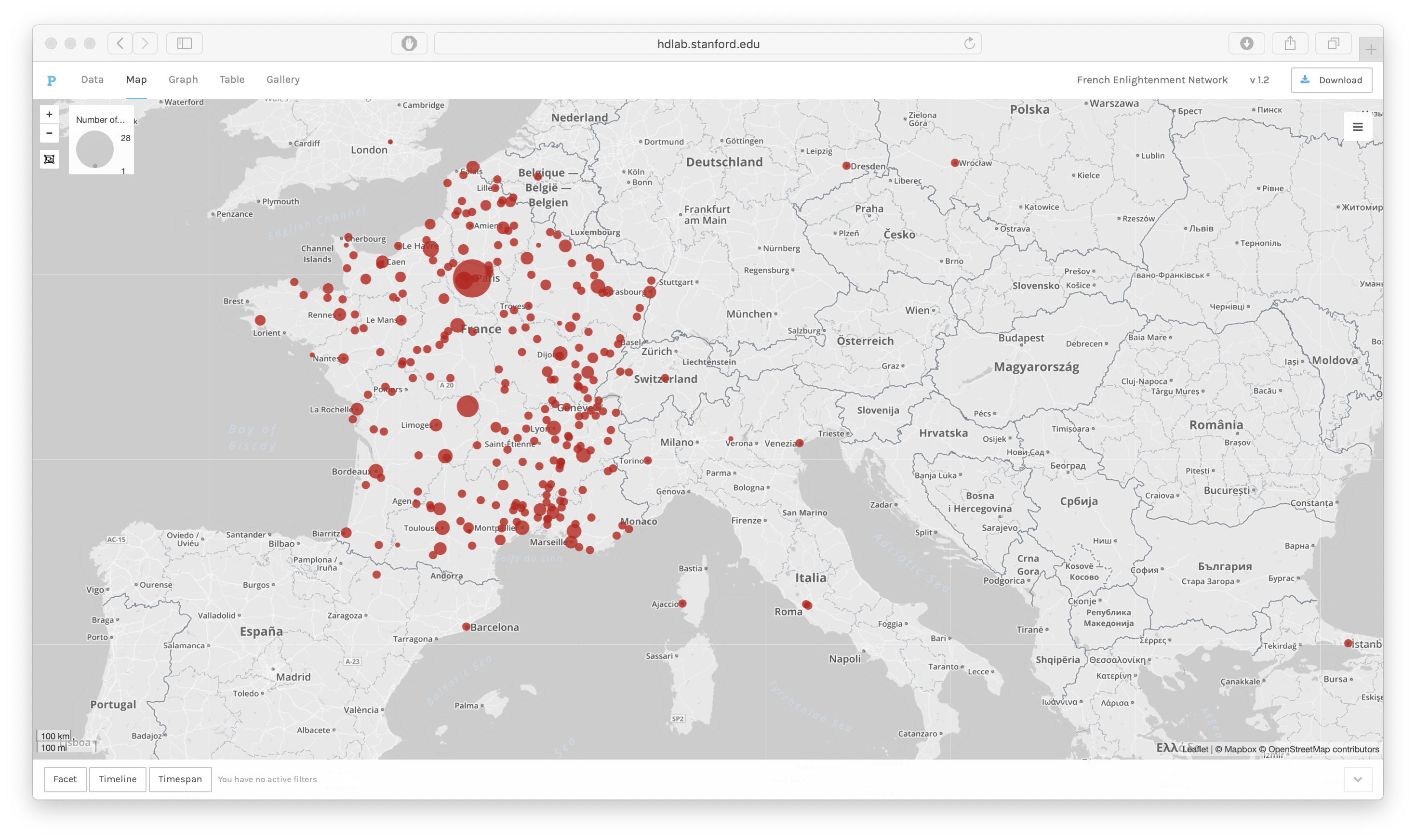
The first type of diagram (Figure 1) consists of points on a map. Producing diagrams
of this kind requires LatLong coordinates for all locations. Such maps can easily
display quantities associated with a particular place — for example, quantities of
people, events, or items. Points maps are recommended for data on population, the
production of books, the number of events, and so on. The nodes can be sized by the
number of records at each LatLong. Figure 1 shows the predominance of Paris as a
birth place for members of the French Enlightenment network. While the size of
smaller points can be hard to make out, numbers of records and the names of places
can be displayed on a tool tip so that hovering over each circle reveals the name and
number of records at each point. Unlike in a list, it is easy to visually compare the
weight of regions. Here the weight of the southeast is notable, despite the relative
insignificance of each point in comparison to the total numbers for Paris. It is also
visible that Lyon, at the center of the map, is a significant location for the birth
of members of this group, although the central region otherwise has few important
locations.
The strength of the points map is how easily it generates a simple geographic
visualization. A list of places with LatLongs can be inputted in the data panel and
visualized within seconds. Alternatively, a dataset can be uploaded with only the
names of places and a separate table with LatLongs can be linked to the dataset.
Doing so is recommended for large datasets with repeated places. Finally, a list of
places with LatLongs could be uploaded with numerical values, such as the number of
people born there. The flexibility of the tool means that many types of data can be
visualized. It also means that an identical visualization can be produced in multiple
ways without modifying the data. One limitation is that latitude and longitude
coordinates must be in the same cell separated by a comma; both values must be
combined before importing the LatLong data into Palladio.
The second kind of map is a point-to-point diagram (see Figure 2). Point-to-point
maps are particularly useful for humanities research because they show network
connections in a way that is intuitive to humanists by overlaying them on a map.
Point-to-point maps are ideal for displaying trajectories, such as travel, or
communication between population centers, such as the sending of letters. This map
type requires LatLong coordinates for two distinct locations. The edges — the
connections between points — could represent any number of other network
relationships between two locations. The points are sized according to the total
count of the items associated with that location. Features that users found lacking
include the lack of directionality in point-to-point maps [
Jensen et al. 2014]
and an inability to produce interactive maps and diagrams [
Posner 2014].
Filtering
While maps are not new tools for humanists, digital technology allows for more
sophisticated and rapid comparisons between subsets of data. Palladio makes filtering
data easy and quick; in fact, producing a different map takes only a few seconds. In
the case of the French Enlightenment Network, the individuals have been coded by
gender, nationality, social networks (Elite, Aristocracy, Military, Court),
professional networks (Artisan, Finance-banking, Cultural, etc.), and knowledge
networks (Letters, Sciences, etc). These individuals also have birth years, death
years, birthplaces, and death places associated with them, where this data is known.
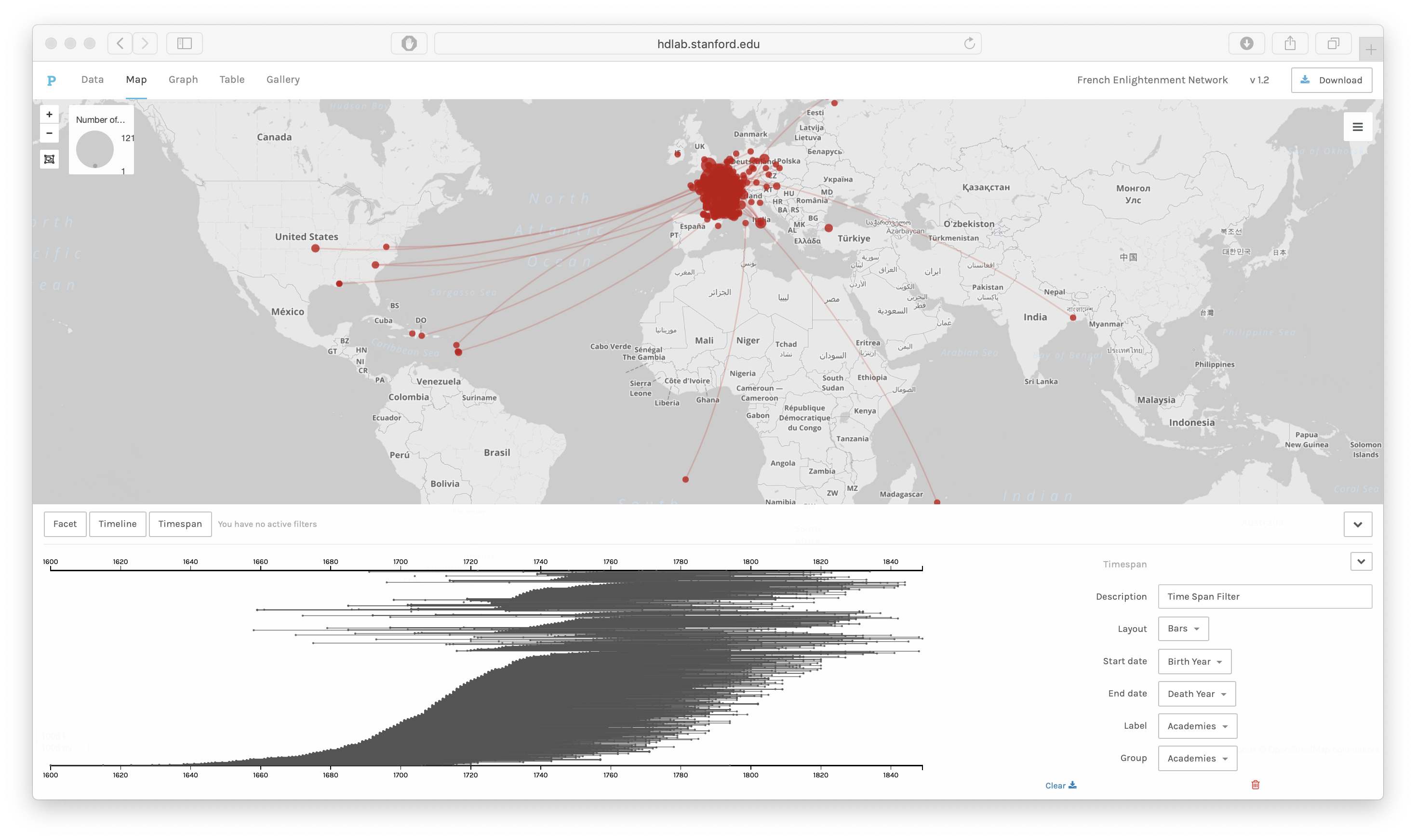
Filtering allows us to look at a series of maps and compare them easily. Figure 3
shows the linked birth and death places of aristocrats in the French Enlightenment
Network.
In order to filter data, a third column should include the categories of places to be
visualized; in this case, the birth places can be filtered by the gender of the
participants in the French Enlightenment or by their participation in other networks
like academies and salons. By comparing maps filtered by category or
timeline/timespan, we can look for patterns in subsets of the data.
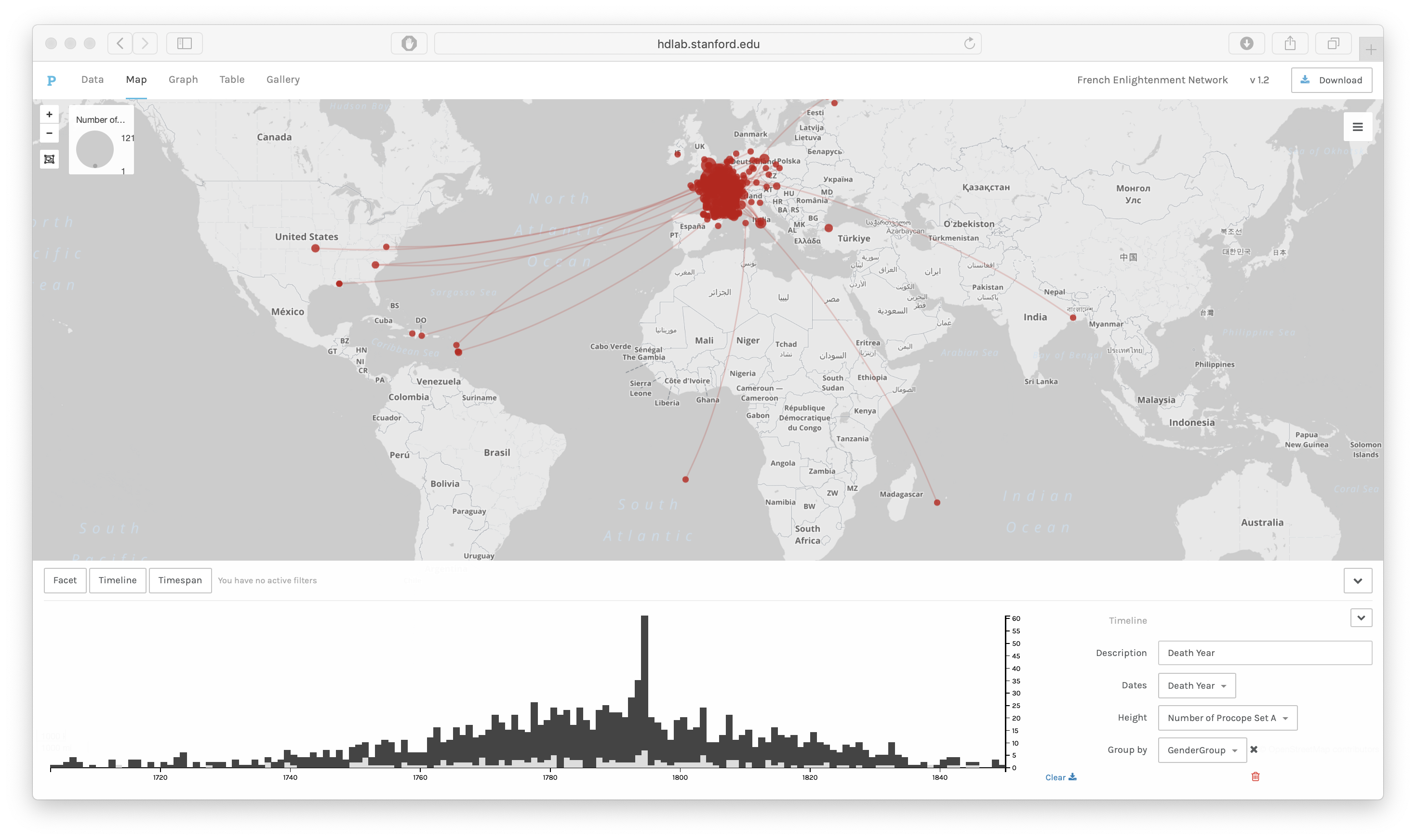
In Figure 4, the linked birth and death places are displayed on a map alongside a
timeline of death years as a bar chart. The timeline can be opened or closed with the
arrows on the right side. It can also be deleted by clicking on the red icon of a
garbage can.
In this diagram, the data points are grouped by gender. The light grey bars represent
the number of women’s deaths in that year and the dark grey bars represent men’s
deaths in that year. As we can see, there are many more men in the dataset who died
in all years, and sometimes no women, yet the women who do appear in the dataset were
more likely to die in later years, and very few women died in the early part of the
eighteenth century. This supports the idea of women becoming more important in
correspondence networks later in the century. Within Palladio, the timeline can also
be filtered by selecting part of the timeline. In that case, only some of the
point-to-point trajectories will be seen on the map. The data can also be grouped by
other categories like nationality and social networks so that we can compare the
geographic and temporal distribution of those groups using the Time Line and the Map
View together.
The Map View with a Time Line has been one of the most popular combinations. The
Sphaera project uses Palladio (among other tools) to investigate “the process of emergence of new epistemic communities”
[
Valleriani et al. 2019]. They use the Map View with a Time Line to visualize
the “geotemporal distribution of the production of the
treatises” in their corpus. Braude’s demo video “Monte
Carlo arrival”
[
Braude 2015] shows how to use Palladio’s point-to-point map and a
timeline to create a video showing historical growth over time. A similar effect can
be used by advancing the timeline and taking snapshots of the map or network and then
labelling the images. The Map View has also been used by various projects to map data
from the Early Modern Letters Online data; one example is “Samuel
Hartlib’s social relationships” on a map with a Time Line [
Tuominen et al. 2018].
Network Graphs
The second type of data visualization to discuss is the Graph View, which is useful
in the study of networked people or things. A network can link people, places, books,
or any other entities that are connected to one another. People or groups are
commonly nodes in graphs of social networks. Network graphs are helpful in seeing
connections between people or groups. They also aid in understanding how groups are
structured. A network graph is a set of points (called nodes), connected by links
(called edges). There exist related software packages for network analysis — notably
Gephi, a computer program designed for the quantitative study of networks that is a
more customizable version of the network function in Palladio. Palladio's network
feature has been used to map the movement of Chinese immigrants from the village of
their origin to destinations in Canada, mostly on the West Coast, recorded between
1886 and 1949 [
Zhang and Cho 2018]. Zhang and Cho found that there was a
clustering effect where immigrants to a particular destination were more likely to
come from the same villages in China. That said, Palladio does not allow for the
computation of clustering coefficients or other analytics that would work at a larger
scale to draw out such relations in a larger dataset.
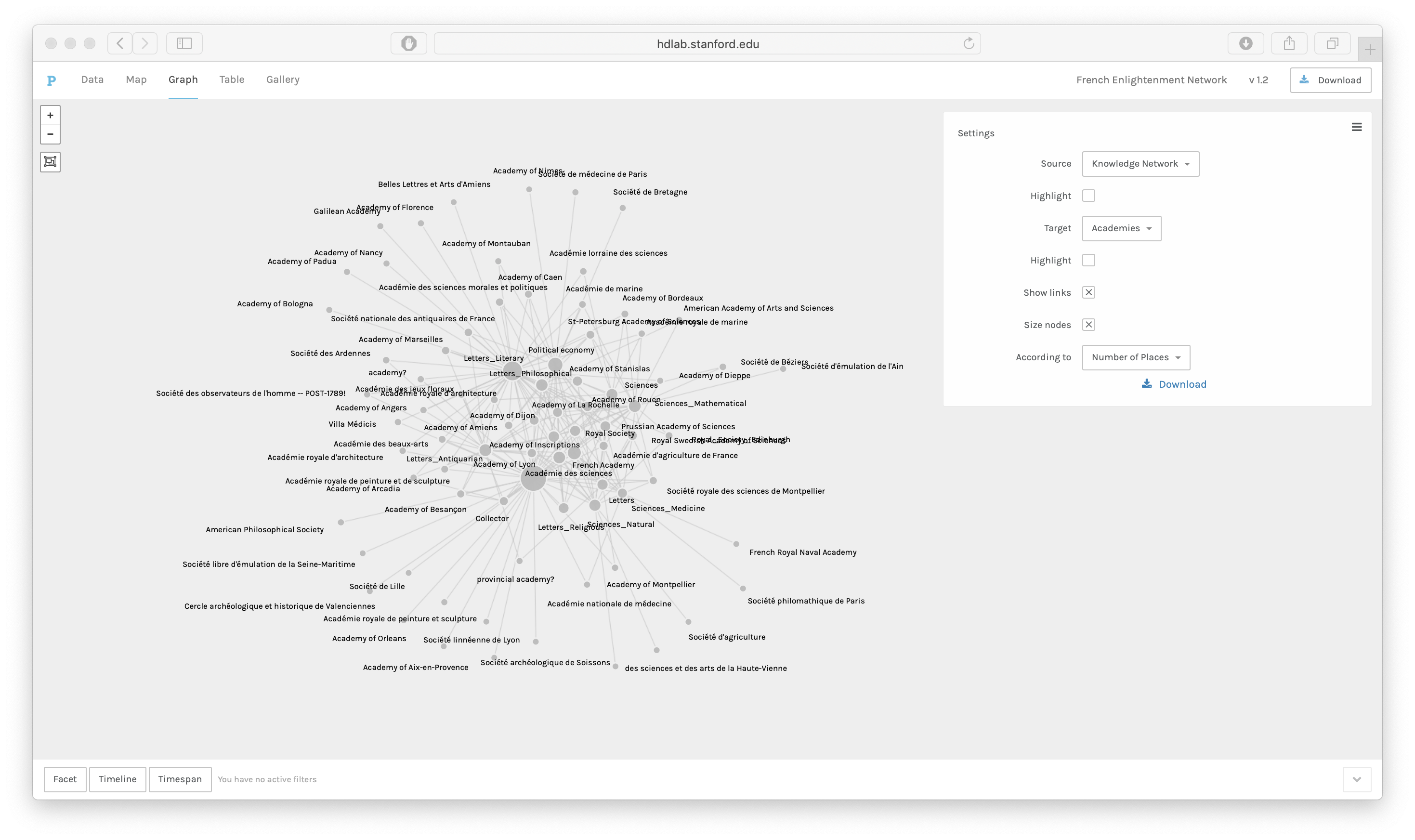
For this demo, I choose “Graph” from the top menu. Figure 5 shows the academy
affiliations of members of the French Enlightenment Network with the knowledge
networks of academy members. Each edge shows a knowledge network that is present in
an academy. The nodes are sized according to the number of members of the academy or
knowledge network. The edges represent knowledge networks that share members of
academies — in other words, this network graph shows the interrelation of
“fields” and academies, not just the disciplines which are represented in the
academies but all of the major interests of academy members, including those that are
not represented in the academies.
Finally, the network graph can be downloaded as an SVG file to further customize the
vector graphics or to integrate the vector graphics into another visual document. The
simple design of the Graph View highlights Palladio’s modern sense of design and a
lack of scientific complexity, which can be refreshing from a design standpoint but,
perhaps, frustrating if taken from the standpoint of a scientific researcher seeking
to encode the maximum amount of information into the data, rather than make a clear
and comprehensible diagram which follows modern design aesthetics.
Tables
A third data visualization, the Table View, is used for creating lists and reordering
data according to various categories. This function is available in spreadsheet
software like Excel, Google Sheets, or OpenRefine, but the tables function in
Palladio is easier to use and does not require the use of formulas or macros. The
data table can also contain more than one column that is rearranged according to the
categories in the first column. Finally, the data table can be filtered easily.
The first step to creating a table in Palladio is to choose a row dimension. The row
dimension provides the categories according to which the rest of the data table will
be re-sorted. If the underlying data have multiple values in the same cell and have
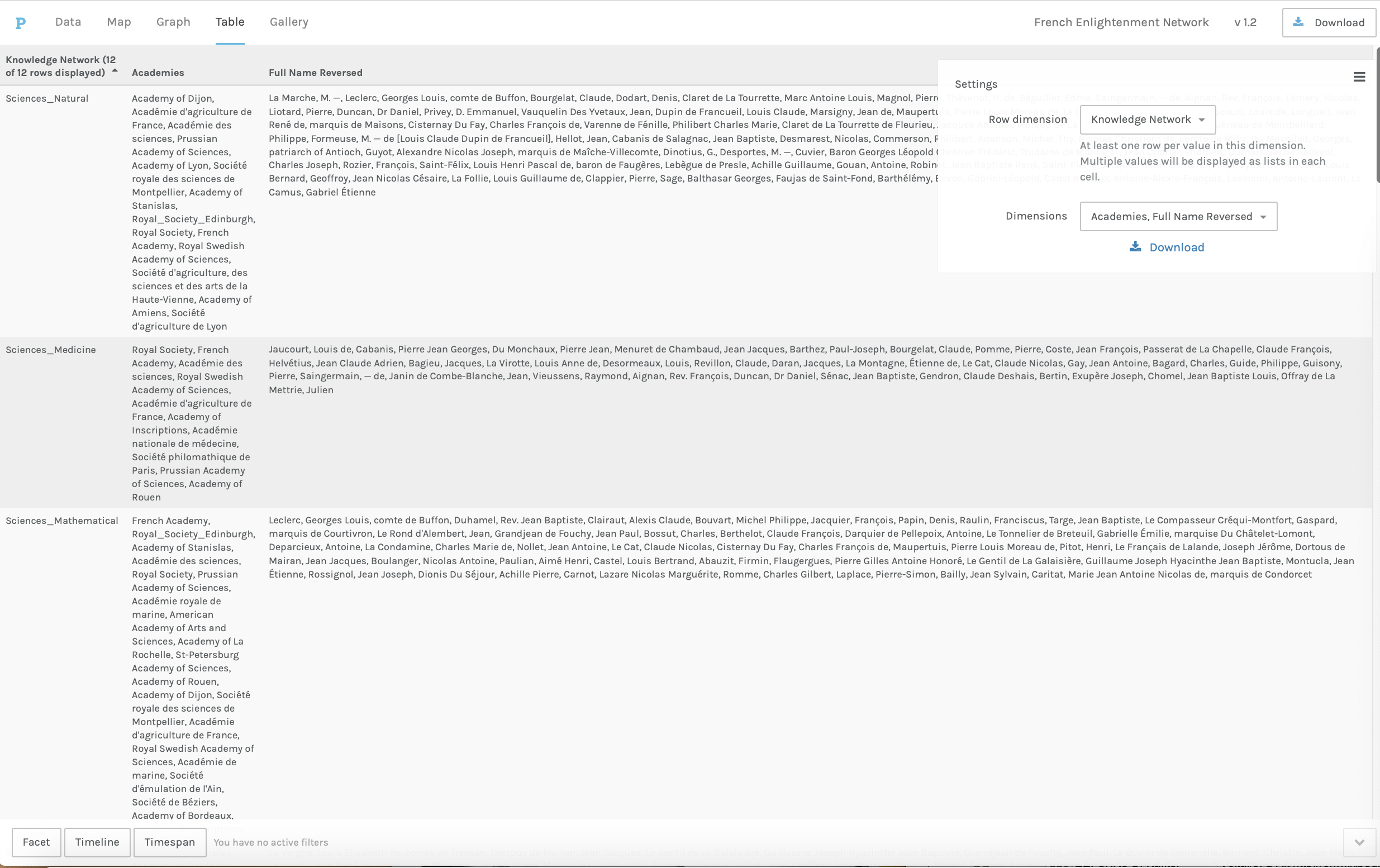
been split, the row categories will reflect that. The example in Figure 6 shows for
the French Enlightenment Network the knowledge network categories (i.e.
Sciences_Natural, Sciences_Medicine, Letters, Letters_Literary, etc) split by a
semi-colon delimiter to create a total of 12 rows. The next step is to choose the
category, or categories, for the other column dimensions; here I have chosen
academies (which were split by a delimiter) and full names, reversed (which were
not). While these same functions can be performed in Excel, adding and removing
dimensions is quick and easy in Palladio, once the data are loaded. The primary
purpose of the tables function is to examine the data up close. Having found patterns
in the map or graph windows, such as connections between two places on a map or
between a field of study or an academy on a network graph, we can easily see which
people or entities are implicated in the table function. In fact, using filters, we
can even examine simultaneously the connection between people, academies, and
places.
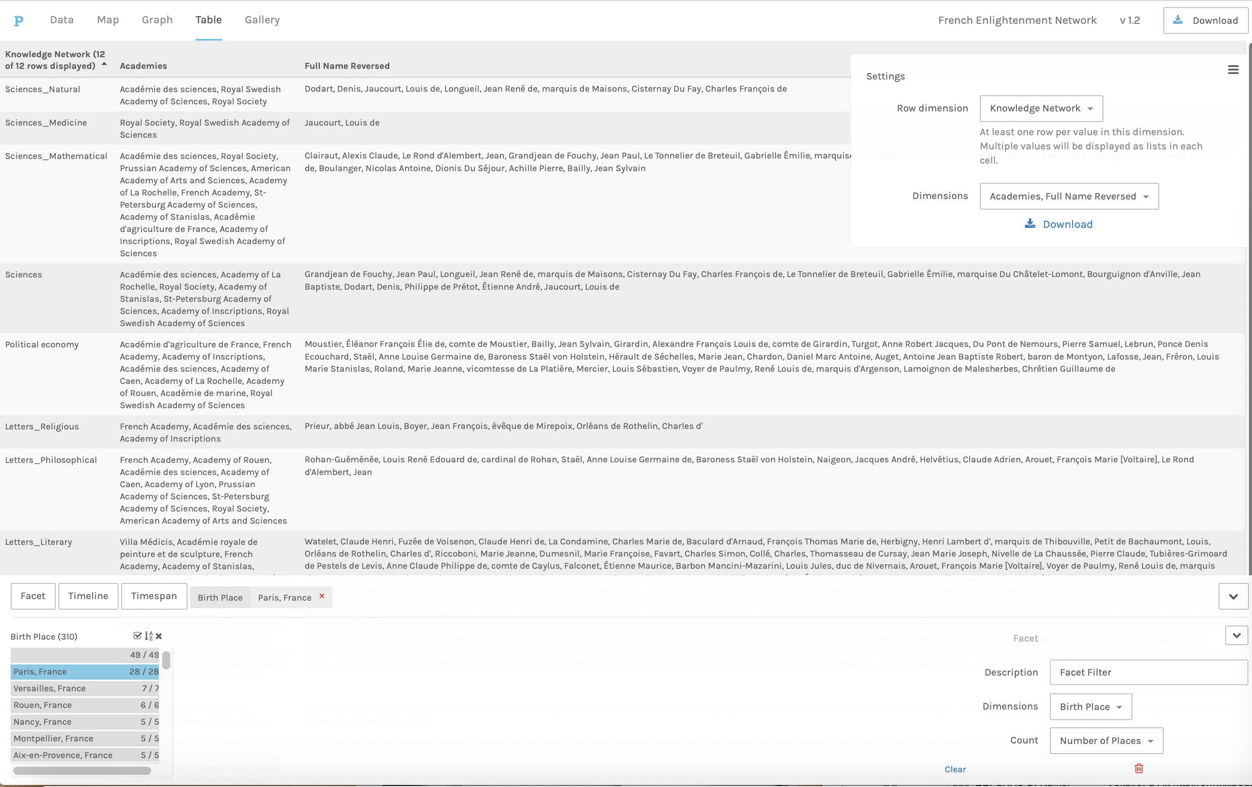
Tables can be filtered by categories, timespan, or timeline to dig deeper into the
data. Let’s look at filtering by categories, since that is the most flexible way of
filtering. In this case, we already know who was associated with particular knowledge
networks and of which academies they were members. If we want to know which of those
people were Parisians, we can simply filter the data table to find only the people
who were born in Paris, who died in Paris, or both (Figure 7); this is possible
because the underlying data already contains that information. If we noticed
interesting patterns in where individuals were born, we could reverse this process
and sort the table according to the row dimension “Birth Place,” and then add
knowledge networks and academies as additional dimensions to see lists of the
academies and knowledge networks associated with those places. Moving between tables
and maps and graphs allows researchers to see the larger picture and dive deeper into
the data without using multiple tools, yet the ability to look at subsets of the data
is more limited than in tools like OpenRefine, or, indeed, Microsoft Excel.
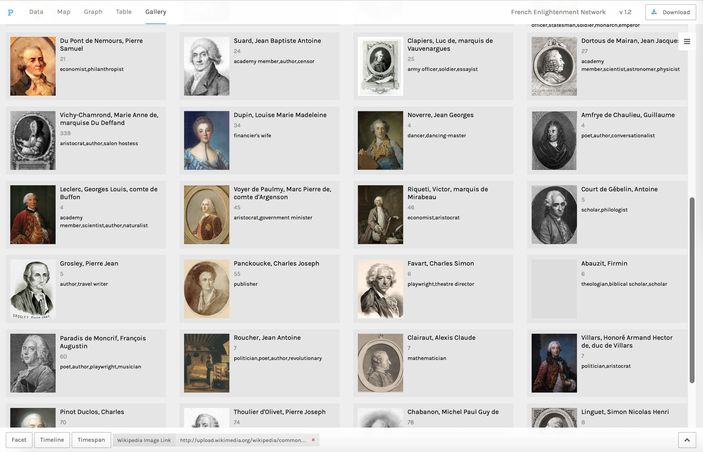
Galleries
The fourth kind of visualization which can be produced in Palladio is the
“Gallery,” or an array of thumbnails. Galleries are filterable and are
particularly useful for large collections of images where the visual aspects of the
image are important enough to make comparing thumbnail versions of the images
productive. Each record must contain the URL of an image which is openly on the
internet on sites like Wikimedia, Imgur, or Google Images. The links can be to images
on multiple sites, but the images must be publicly hosted; it is not possible to link
to private or paywalled repositories like Artstor. It is possible to designate a
column as containing the title and subtitle for each image and another as containing
the URL linking the image.
In Figure 8, the image links are Wikimedia image URLs for portraits of historical
individuals, the URLs are Wikipedia for biographies, the full name (reversed) is
designated as the title, and the subtitle is the person’s occupation from the
Electronic Enlightenment data.
Galleries can be quickly filtered so that only the images associated with a specific
value in another column will be shown; for instance, by gender or professional
network. They can also be filtered by timeline or timespan.
Figure 9 shows the same gallery with a timespan filter and social networks as the
subtitle. The Timespan filter has three different layouts: bars, parallel, or grouped
bars. Filtering by timespan requires start and end dates. It is also possible to
choose a data column to group the bars and a tooltip label. The timespan can be
filtered by clicking and holding to select a portion of the timespan, and only the
entities whose timelines appear within that span will be displayed in the gallery.
While the galleries are not very different from the tables insofar as they primarily
show lists of entities which can be filtered, tables allow for easier reorganization
of data and galleries foreground the visual element. Galleries do have additional
uses in art history, architecture, film studies, and other disciplines where large
numbers of images may be associated with dates or other time stamps and being able to
filter those images by category or time could bring additional insight.
Conclusions
As quintessential “middleware” for digital historians and literary/cultural
historians, Palladio is ideal for producing static maps and network diagrams
sequentially to explore data, especially when time and geography are important
elements of the dataset. The ability in Palladio to toggle between different types of
visualizations without re-importing the dataset is a benefit for prototyping diagrams
and moving between the visualization and the data. The option to filter data and
split multiple values means that many different data structures can be used, and the
same dataset can produce many different types of diagrams. The static diagrams
produced in Palladio can be used in publications, since high resolution screenshots
can meet standards for publication. The SVG and TXT files can also be downloaded for
further processing and incorporation into more elaborate graphics in programs like
Adobe Illustrator. The same diagrams can be produced with different color and
contrast settings, although the “land” and “streets” greyscale base maps do
not have high enough contrast to be legible when projected; the full-color
“Buildings and Areas,”
“Terrain,” or “Satellite” maps are usually better for presentations.
Similar issues may arise with diagrams produced in the other tools, since they are
optimized for greyscale publication and the contrast may need to be increased or
color introduced in order to make projected diagrams visible. This emphasis on maps
and time is a strength when projects have a strong geospatial element but can be a
weakness when geospatial patterns are less relevant to the matter at hand.
Finally, Palladio is useful in teaching because the data and formatting are easily
shareable. It can also be used when teaching how to create visualizations and how to
use visualization to explore data, as Joel Blecher has shown in his pedagogical
article on using Palladio, along with RAW graphs, in group work in a class on the
transmitters of early Islamic law [
Blecher 2016]. The ability to
download a formatted JSON file and share that with other researchers or students
means that others can import pre-verified data — for example, a map which already has
the coordinates selected and visualized or a gallery which already has the filters
applied. Because the formatting is included in the JSON file, the person receiving
the file, whether a student or a researcher, can open the file where the previous
researcher left off and see what that person saw. Any changes to the formatting can
be saved by the second person and sent back as a JSON file to the first person. This
makes Palladio an ideal tool for experimentation by students for creating different
diagrams, especially when there is not class time to create and verify an original
dataset. Students can use the same dataset, or a selection of pre-verified datasets,
and still save their work. A student who has created her own dataset can also share
it with the class or instructor, and others can see both the visualizations and the
underlying data.
While Palladio is a very flexible tool, it does have some inherent limitations, most
of which come from the fact that it is highly useable. Data cannot be edited within
Palladio. In practice, this often means creating a dataset, importing it into
Palladio, visualizing it, and then discovering errors — such as typos which cause the
value to appear twice in a network diagram or differing coordinates for the same
place — only to have to restart the process to correct the data. This limitation
means that Palladio is very useful for creating many diagrams quickly with a verified
dataset — or, indeed, finding problems or outliers in a dataset — but Palladio is
consequentially most useful at the exploratory phase. As one gets to know the dataset
better and finds patterns that are worth visualizing, it may become apparent that a
more complex visualization is necessary to show patterns that appear within filtered
maps or network graphs. One way to show such patterns in publication is small
multiples, or small diagrams with variations in what is presented, displayed
side-by-side. If small multiples are insufficiently complicated, more sophisticated
diagrams may be necessary. In order to create complex network diagrams or interactive
maps, the researcher will have to use tools that are more customizable and have more
options for visualization and design than Palladio.
Palladio is most useful at the exploratory stages of a project, for teaching, and for
collectively working through visualization problems, and less so in the latter stages
of a complex project. The core assumption of the technology is that information
visualization is primarily a process of designing visualizations that make historical
arguments, rather than quantitative or scientific ones. The prioritization of moving
between individual data points and their whole presumes enough familiarity with the
underlying dataset that both the tabular information and the visualizations will make
patterns apparent to the researcher rather than providing quantitative answers.
Works Cited
Bastian et al. 2009 Bastian, M., Heymann, S., &
Jacomy, M. “Gephi: An Open Source Software for Exploring and
Manipulating Networks,” in
Third International AAAI
Conference on Weblogs and Social Media (2009), pp. 361-362. DOI:
https://doi.org/10.1007/978-1-4614-6170-8_299.
Blecher 2016 Blecher, J. “Pedagogy and the Digital Humanities: Undergraduate Exploration into the
Transmitters of Early Islamic Law.” In E. Muhanna (ed.), The Digital Humanities and Islamic & Middle East
Studies, Berlin: De Gruyter (2016), pp. 233-249.
Ciuccarelli 2014 Ciuccarelli, P. “Mind the Graph: From Visualization to Collaborative Network
Constructions,”
Leonardo 47.3 (2014): 268-269. DOI:
https://doi.org/10.1162/LEON_a_00772
Comsa et al. 2014 Comsa, M.T., Conroy, M., Edmondson,
C., Edelstein, D., Willan, C., Groupe d’Alembert, & Electronic Enlightenment
Project. “French Correspondents of Major Enlightenment
Figures,” Stanford Digital Repository (2014),
http://purl.stanford.edu/bc436tm1194
Comsa et al. 2016 Comsa, M.T., Conroy, M., Edmondson,
C., Edelstein, D., & Willan, C. “The French Enlightenment
Network,”
The Journal of Modern History 88.3 (2016): 495-534. DOI:
https://doi.org/10.1086/687927.
Edelstein et al. 2017 Edelstein, D., Findlen, P.,
Ceserani, G., Winterer, C., and Coleman, N. “Historical Research
in a Digital Age: Reflections from the Mapping the Republic of Letters
Project,”
The American Historical Review 122.2 (2017):
400-424. DOI:
https://doi.org/10.1093/ahr/122.2.400.
Koivisto 2019 Koivisto, N. “New
Data, New Methods? Sources on Ladies’ Salon Orchestras in Europe,
1870–1918,” Музикологија / Musicology 26
(2019): 41-60.
Mauri et al. 2017 Mauri, M., Elli, T., Caviglia, G.,
Uboldi, G., and Azzi, M. “RAWGraphs: A Visualisation Platform to
Create Open Outputs,” in
Proceedings of the 12th
Biannual Conference on Italian SIGCHI Chapter (CHItaly '17) (2017),
article 28. DOI:
https://doi.org/10.1145/3125571.3125585.
Tuominen et al. 2018 Tuominen, J., Mäkelä, E.,
Hyvönen, E., Bosse, A., Lewis, M., & Hotson, H. “Reassembling
the Republic of Letters – A Linked Data Approach,” in DHN (2018), pp. 76-88.
Uboldi et al. 2013 Uboldi, G., Caviglia, G., Coleman,
N., Heymann, S., Mantegari, G., and Ciuccarelli, P. “Knot: An
Interface for the Study of Social Networks in the Humanities,” in
Proceedings of the Biannual Conference of the Italian Chapter of
SIGCHI (CHItaly '13) (2013), article 15. DOI:
https://doi.org/10.1145/2499149.2499174.
Valleriani et al. 2019 Valleriani, M., Kräutli,
F., Zamani, M., Tejedor, A., Sander, C., Vogl, M., Betram, S., Funke, G., &
Kantz, H. “The Emergence of Epistemic Communities in the
‘Sphaera’ Corpus: Mechanisms of Knowledge Evolution,”
Journal of Historical Network Research 3 (2019): 50-91.
DOI:
https://doi.org/10.25517/jhnr.v3i1.63.
Zhang and Cho 2018 Zhang, S. & Cho, A. “Untapped Potential: Mining Register of Chinese Immigrants to Canada,
1886-1949 Using R and Palladio,” OSF Preprints [2018],
https://osf.io/xg5nj.