Abstract
As digital humanists have adopted visualization tools in their work, they have borrowed
methods developed for the graphical display of information in the natural and social
sciences. These tools carry with them assumptions of knowledge as observer-independent and
certain, rather than observer co-dependent and interpretative. This paper argues that we
need a humanities approach to the graphical expression of interpretation. To begin, the
concept of data as a given has to be rethought through a humanistic lens and
characterized as capta, taken and constructed. Next, the forms for graphical
expression of capta need to be more nuanced to show ambiguity and complexity. Finally, the
use of a humanistic approach, rooted in a co-dependent relation between observer and
experience, needs to be expressed according to graphics built from
interpretative models. In summary: all data have to be understood as capta and the
conventions created to express observer-independent models of knowledge need to be
radically reworked to express humanistic interpretation.
Introduction
As digital visualization tools have become more ubiquitous, humanists have adopted many
applications such as GIS mapping, graphs, and charts for statistical display that were
developed in other disciplines. But, I will argue, such graphical tools are a kind of
intellectual Trojan horse, a vehicle through which assumptions about what constitutes
information swarm with potent force. These assumptions are cloaked in a rhetoric taken
wholesale from the techniques of the empirical sciences that conceals their
epistemological biases under a guise of familiarity. So naturalized are the Google maps
and bar charts generated from spread sheets that they pass as unquestioned representations
of “what is”. This is the hallmark of realist models of knowledge and needs to be
subjected to a radical critique to return the humanistic tenets of constructed-ness and
interpretation to the fore. Realist approaches depend above all upon an idea that
phenomena are
observer-independent and can be characterized as
data. Data pass themselves off as mere descriptions of a priori conditions.
Rendering
observation (the act of creating a statistical, empirical, or subjective account
or image) as if it were
the same as the phenomena observed collapses the
critical distance between the phenomenal world and its interpretation, undoing the basis
of interpretation on which humanistic knowledge production is based. We know this. But we
seem ready and eager to suspend critical judgment in a rush to visualization. At the very
least, humanists beginning to play at the intersection of statistics and graphics ought to
take a detour through the substantial discussions of the sociology of knowledge and its
developed critique of realist models of data gathering
[1]
At best, we need to take on the challenge of developing graphical expressions rooted in
and appropriate to interpretative activity.
Because realist approaches to visualization assume transparency and equivalence, as if
the phenomenal world were self-evident and the apprehension of it a mere mechanical task,
they are fundamentally at odds with approaches to humanities scholarship premised on
constructivist principles. I would argue that even for realist models, those that presume
an observer-independent reality available to description, the methods of presenting
ambiguity and uncertainty in more nuanced terms would be useful. Some significant progress
is being made in visualizing uncertainty in data models for GIS, decision-making,
archaeological research and other domains.
[2] But an important
distinction needs to be clear from the outset: the task of representing ambiguity and
uncertainty has to be distinguished from a second task – that of using interpretations
that arise in observer-codependence, characterized by ambiguity and uncertainty, as the
basis on which a representation is constructed. This is the difference between putting
many kinds of points on a map to show degrees of certainty by shades of color, degrees of
crispness, transparency etc., and creating a map whose basic coordinate grid is
constructed
as an effect of these ambiguities. In the first instance, we have
a standard map with a nuanced symbol set. In the second, we create a non-standard map that
expresses the constructed-ness of space. Both rely on rethinking our approach to
visualization and the assumptions that underpin it.
To overturn the assumptions that structure conventions acquired from other domains
requires that we re-examine the intellectual foundations of digital humanities, putting
techniques of graphical display on a foundation that is humanistic at its base. This
requires first and foremost that we reconceive all data as capta. Differences in
the etymological roots of the terms data and capta make the distinction between
constructivist and realist approaches clear. Capta is “taken” actively while
data is assumed to be a “given” able to be recorded and observed. From this
distinction, a world of differences arises. Humanistic inquiry acknowledges the situated,
partial, and constitutive character of knowledge production, the recognition that
knowledge is constructed, taken, not simply given as a natural representation
of pre-existing fact.
My distinction between data and capta is not a covert suggestion that the humanities and
sciences are locked into intellectual opposition, or that only the humanists have the
insight that intellectual disciplines create the objects of their inquiry. Any
self-conscious historian of science or clinical researcher in the natural or social
sciences insists the same is true for their work. Statisticians are extremely savvy about
their artifices. Social scientists may divide between realist and constructivist
foundations for their research, but none are naïve when it comes to the rhetorical
character of statistics. The history of knowledge is the history of forms of expression of
knowledge, and those forms change. What can be said, expressed, represented in any era is
distinct from that of any other, with all the attendant caveats and reservations that
attend to the study of the sequence of human intellectual events, keeping us from any
assertion of progress while noting the facts of change and transformation. The historical,
critical study of science is as full of discussions of this material as the
humanities.
Thus the representation of knowledge is as crucial to its cultural force as
any other facet of its production. The graphical forms of display that have come to the
fore in digital humanities in the last decade are borrowed from a mechanistic approach to
realism, and the common conception of data in those forms needs to be completely rethought
for humanistic work. To reiterate what I said above, the sheer power of the graphical
display of “information visualization” (and its novelty within a humanities community
newly enthralled with the toys of data mining and display) seems to have produced a
momentary blindness among practitioners who would never tolerate such literal assumptions
in textual work.
The polemic I set forth here outlines several basic principles on which to proceed
differently by suggesting that what is needed is not a set of applications to
display humanities “data” but a new approach that uses humanities principles to
constitute capta and its display. At stake, as I have said before and in many
contexts, is the authority of humanistic knowledge in a culture increasingly beset by
quantitative approaches that operate on claims of certainty. Bureaucracies
process human activity through statistical means and when the methods grounded in
empirical sciences are put at the service of the social sciences or humanities in a
crudely reductive manner, basic principles of critical thought are violated, or at the
very least, put too far to the side. To intervene in this ideological system, humanists,
and the values they embrace and enact, must counter with conceptual tools that demonstrate
humanities principles in their operation, execution, and display. The digital humanities
can no longer afford to take its tools and methods from disciplines whose fundamental
epistemological assumptions are at odds with humanistic method.
This paper is a call to imaginative action and intellectual engagement with the challenge
of rethinking digital tools for visualization on basic principles of the humanities. I
take these principles to be, first, that the humanities are committed to the concept of
knowledge as interpretation, and, second, that the apprehension of the phenomena of the
physical, social, cultural world is through constructed and constitutive acts, not
mechanistic or naturalistic realist representations of pre-existing or self-evident
information. Nothing in intellectual life is self-evident or self-identical, nothing in
cultural life is mere fact, and nothing in the phenomenal world gives rise to a record or
representation except through constructed expressions. The rhetorical force of graphical
display is too important a field for its design to be adopted without critical scrutiny
and the full force of theoretical insight. Let me suggest what that means for the
visualization of informational, temporal, and spatial phenomena.
Data as capta: from information visualization to graphical expressions of
interpretation
If I set up a bar chart or graph, my first act is to draw a set of one or more axes and
divide them into units. The conventional forms of the graphical display of information,
“data”, make use of a formal, unambiguous system of standard metrics. Charts use simple
(if often misleading) geometric forms that lend themselves to legible comparison of
values, proportions, or the exhibition of state changes across time. Lines, bars, columns,
and pie charts are the common and familiar forms. They render quantitative
relations with a transparency that seems natural, so that, for instance, if we look at the
changes in population across a series of years for a particular location, we can simply
accept that from one year to the next rises or drops occurred in the numbers of persons
alive in X city in X country at X time. A pie chart showing percentage of resource
allocation from national budgets seems completely transparent, self-evident even. A bar
chart could compare daylight hours at different longitudes, or the average size of men and
women in different countries, or the number of hospital beds in different institutions in
a single geographical location and not raise a skeptical eyebrow, right? Yes, but the
rendering of statistical information into graphical form gives it a simplicity and
legibility that hides every aspect of the original interpretative framework on which the
statistical data were constructed. The graphical force conceals what the statistician
knows very well — that no “data” pre-exist their parameterization. Data
are capta, taken not given, constructed as an interpretation of the phenomenal
world, not inherent in it.
To expose the constructedness of data as capta a number of systematic changes have to be
applied to the creation of graphical displays. That is the foundation and purpose of a
humanistic approach to the qualitative display of graphical information.
Read that last formulation carefully, humanistic approach means that the
premises are rooted in the recognition of the interpretative nature of
knowledge, that the display itself is conceived to embody qualitative
expressions, and that the information is understood as graphically
constituted. Each of these factors contains an explicit critique of assumptions
in the conventional “visual display of quantitative information” that is the common
currency.
Let me work through a specific case to show how each of these principles —
humanistic approach, qualitative display, and graphical information — can be
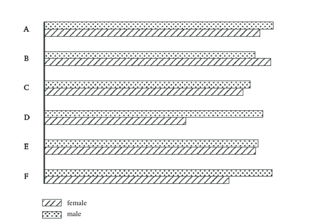
demonstrated. As an example, we can use that bar chart mentioned above, one that compares
the percentage of men and women in various national populations at the present time.
Certain issues immediately arise. A standard critique of data introduces reservations
about the appearance of certainty such a chart presents. What counts as a nation? Are
transient and immigrant populations documented? What kind of time span counts as “at the
present time” within which these populations are counted? If the basic bar chart would
have looked like a series of bands showing discrete categories of information in finite
and certain numbers (all due statistical caveats noted), what are the problems? Gender
definition assumes a simple binary distinction of men and women, an assumption much
debated and highly problematic (gender can be understood as a factor of behavior,
physiological changes, social expectations, dress, etc., and nation as a function of
permeability of borders, citizenship patterns, naturalization rules, immigration
regulations, quotas and border policies). So the bar chart reifies several categories,
naturalizing them as discrete and fixed: national populations, time span, and gender
defined as a simple binary. The representation can only be modified by changing the terms
and premises on which it is constructed. What would a representation of gender by sliding
scale look like? How would permeable boundaries to nations whose populations cross each
others borders be shown? How would they dissolve the bar chart’s basic structure? How
would notions of the present be defined?
The point I’m making is that the basic categories of supposedly quantitative information,
the fundamental parameters of chart production, are already interpreted expressions. But
they do not present themselves as categories of interpretation, riven with ambiguity and
uncertainty, because of the representational force of the visualization as a
“picture” of “data”. For instance, the assumption that gender is a binary category, stable
across all cultural and national communities, is an assertion, an argument. Gendered
identity defined in binary terms is not a self-evident fact, no matter how often Olympic
committees come up against the need for a single rigid genital criterion on which to
determine difference. By recognizing the always interpreted character of data we have
shifted from data to capta, acknowledging the constructed-ness of the categories according
to the uses and expectations for which they are put in service. Nations, genders,
populations, and time spans are not self-evident, stable entities that exist a priori.
They are each subject to qualifications and reservations that bear directly on and arise
from the reality of lived experience. The presentation of the comparison in the original
formulation grotesquely distorts the complexity — but also, the basic ambiguity
— of the phenomenon under investigation (gender, nations, populations). If the
challenge we are facing were merely to accommodate higher levels of complexity into a data
representation model, that would require one set of considerations and modifications. But
the more profound challenge we face is to accept the ambiguity of knowledge, the
fundamentally interpreted condition on which data is constructed, in other words, the
realization of my refrain–that all data is capta.
The humanistic aspect of this approach should be obvious — that knowledge
created with the acknowledgement of the fundamentally constructed nature of its premises
is not commensurate with principles of certainty guiding empirical or realist methods.
Humanistic methods are counter to the idea of reliably repeatable experiments or standard
metrics that assume observer independent phenomena. By definition, a humanistic approach
is centered in the experiential, subjective conditions of interpretation. Phenomena and
their observers are co-dependent, not necessarily in equal measure. A viewer gazing on a
sublime landscape or recording migrations at a large scale may be more affected by the
phenomena than the phenomena is by the observation. Theoretical physicist Werner
Heisenberg never suggested that the relation of intervening observer and effect on
phenomena were symmetrical, merely that they were codependent, when he introduced the
concept of uncertainty in the early 20th century.
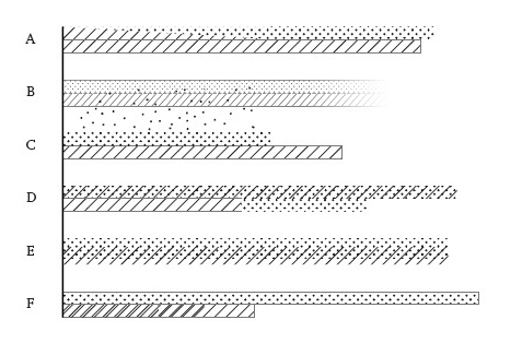
Creating bar charts with ambiguity and degrees of uncertainty or other variables in them
might cause champions of legibility and transparency some unease, but the shift away from
standard metrics to metrics that express interpretation is an essential move for humanists
and/or constructivists across disciplines. To emphasize the expressive quality of
interpretation, I’m going to characterize constructed information as
subjective – expressing the marks of its inflection in some formal way. The
shift to expressive metrics and graphics is essential in changing from the
expression of subjective information to the
subjective expression of
perceived phenomena, but subjectivity and inflection are not the only features of
interpretative approaches. Capta is not an expression of idiosyncracy, emotion, or
individual quirks, but a systematic expression of information understood as constructed,
as phenomena perceived according to principles of interpretation. To do this, we need to
conceive of every metric “as a factor of X”, where X is a point of view, agenda,
assumption, presumption, or simply a convention. By qualifying any metric as a factor of
some condition, the character of the “information” shifts from self-evident
“fact” to
constructed interpretation motivated by a human agenda.
[3]
The standard elements of graphic display for statistical information are simple and
limited: scale divisions, coordinate lines, scale figures, circles, rectangles, curves,
bars (or columns or percentages of pie charts or other forms) and labels (numbers and
terms), signs of movement, flow, or state change (arrows, vectors, paths). The ordering
and arrangement of elements within a chart create another level of information, relational
information. Relational information is graphically produced – the ordering of elements by
size, by color, by alphabetical order, by texture, shape or other feature happens in
graphical space. The resulting arrangement has a semantic value produced by features of
proximity, grouping, orientation, apparent movement, and other graphical effects.
Now take these basic elements of graphical display and rethink them according to
humanistic principles:
In conventional statistical graphics, the scale divisions are equal units. In humanistic,
interpretative, graphics, they are not.
In statistical graphics the coordinate lines are always continuous and straight. In
humanistic, interpretative, graphics, they might have breaks, repetitions, and curves or
dips. Interpretation is stochastic and probabilistic, not mechanistic, and its
uncertainties require the same mathematical and computational models as other complex
systems.
The scale figures and labels in statistical graphics need to be clear and legible in all
cases, and all the more so in humanistic, interpretative, graphics since they will need to
do quite a bit of work.
Perhaps the most striking feature distinguishing humanistic, interpretative, and
constructivist graphical expressions from realist statistical graphics is that the curves,
bars, columns, percentage values would not always be represented as discrete bounded
entities, but as conditional expressions of interpretative parameters–a kind of visual
fuzzy logic or graphical complexity. Thus their edges might be permeable, lines dotted and
broken, dots and points vary in size and scale or degree of ambiguity of placement, and so
on. These graphical strategies express interpreted knowledge, situated and partial, rather
than complete. They can be employed as systematically as other charting elements, though
part of my intention is to disturb the grounds of certainty on which conventions of
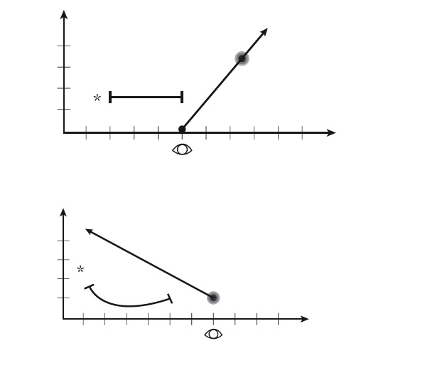
statistical legibility are based. Point of view systems introduced into graphs and charts
will make evident a perspectival position with respect to their information, an inner
standing point in the graphical rendering of space. This is true of all cartographic
projections. Every map contains within its coordinate system for graphical expression, a
set of assumptions about the place from which the map is drawn. Information spaces drawn
from a point of view, rather than as if they were observer independent, reinsert the
subjective standpoint of their creation into the graphical expression. Finally, any point
or mark used as a specific node in a humanistic graph is assumed to have many dimensions
to it – each of which complicates its identity by suggesting the embedded-ness of its
existence in a system of co-dependent relations. Information entities, or units, are thus
understood as fictional abstractions serving a purpose. But their potential to be read
again in relation to any number of other equally significant relations can be made
evident. This approach destroys the ground on which standard metrics are used to abstract
quantitative information from human circumstances. Humanistic premises replace notions of
statistical concepts of self-identity with entangled co-dependence and contingencies.
All of this may sound unduly complicated to someone merely wanting to count the number of
pupils enrolled in a group, calculate the number of pencils needed, or to show budgetary
expenditures on a per capita basis in the classroom, for example. But this example
— an instance of administrative and bureaucratic management — shows
that such crudely conceived numeric statistics are useful only in the most reductive
circumstances. They tell us nothing about whether the pencils can be used, whether the
pupils are prepared or disposed to their work, or whether the budgets will have any effect
on learning outcomes or any of the many other factors that come into play in assessments
based on metrics extracted from lived experience. But each metric — number of X
or Y — is actually a number as a factor of a particular intellectual assumption
or decision: pupils as a factor of seats in a room, birthdates, population, illness, etc.
pencils as a factor of resource allocation, and so on. All metrics are metrics about
something for some purpose.
Any humanistic study based on statistical methods, even the simplest techniques of
counting, has to address the assumption involved in the categories on which such
techniques (“how many of X”) are based. Take another example from work in data mining or
“distant reading” as it is known in the digital humanities: counting the number of novels
published in a given year. This involves an enormous number of interpretative decisions –
each of which has more intellectual dimensions than any numeric assessment could.
For instance, what is a novel, what does “published” mean in this context (date of
appearance, editing, composition, acquisition, review, distribution), and how was the
“year” determined. Statistical methods come into play after these decisions
have been made, counting objects whose identity was established by interpretative
decisions. Many aspects of constructed-ness are in play. But the graphical
presentation of supposedly self-evident information (again, formulated in this example as
“the number of novels published in a year”) conceals these complexities, and the
interpretative factors that bring the numerics into being, under a guise of graphical
legibility. I cannot overstate the perniciousness of such techniques for the effect of
passing construction off as real, and violating the very premises of humanistic
inquiry.
The challenge is to design graphical expressions suited to the display of interpreted
phenomena: information about subjective user-dependent metrics,
subjective displays of information, and subjective methods of
graphical expression. The term subjective is used as shorthand for interpretative
construction, for the registration of point of view, position, the place from which and
agenda according to which parameterization occurs. Subjectivity is not the same as
individual inflection or mere idiosyncracy, but is meant to put codependent relations of
observer and phenomena (in contrast to presumptions of objectivity, or
observer-independent phenomena).
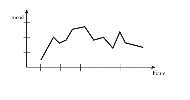
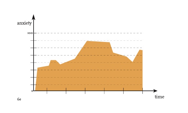
The display of information about inflection of affective experience can easily use
standard metrics. For example, a chart that shows mood changes or degrees of attraction or
any other information related to subjectivity can be created with standard metrics and
visual conventions.
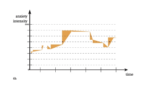
The next task is more complicated. Subjective information, that is information whose
constitution exhibits its subjective character, deviates from the standard norms by using
graphic variables such as intensity of tone, size, color, or other feature to embody its
qualities. Subjective information can use graphical means to show its inflected character,
demonstrating its deviation from standard norms in the way the display looks, or, in
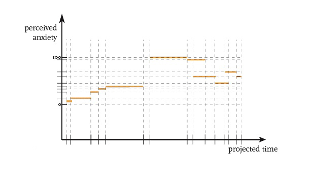
dynamic displays, the way it acts. One might imagine skittish points on an
unstable grid to display the degrees of anxiety around a particular event or task, for
instance, or points that glow hot or cold depending on the other elements that approach
them. That would be a subjective — even affective — display of
information.
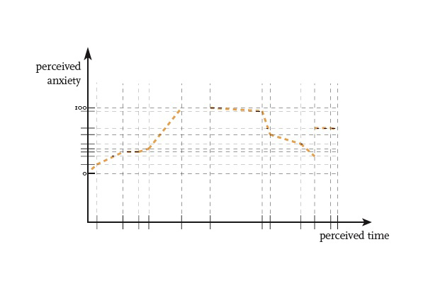
Creating a display whose structure arises from subjective methods of
graphical expression extends this last example to the design of the basic visual
structure.
A subjective grid to show anxiety might have a widely varying set of spacings to show
that the information on display is constituted as a variable of some other aspect of
experience (number of family members present at an event, for instance). Recognizing that
such subjective methods are anathema to the empirically minded makes me even more
convinced that they are essential for the generation of graphical displays of
interpretative and interpreted information.
The basic principle underlying such graphical displays is that capta marks its
interpreted status. Interpreted knowledge is situated, observer co-dependent, and partial.
Its variables are, in theory, infinite, but they are always present in some degree or
measure by virtue of the performative and participatory character of interpretative
information. Interpretation depends upon and is an expression of an individual reading in
a particular set of circumstances and never presumes to completeness or observer
independence. The requirements for legibility increase with these unfamiliar graphics, and
they will need labeling to make explicit the justifications for their non-normative
seeming appearance. I’m not advocating idiosyncracy, or intellectual solipsism, but a
systematic approach to graphics that is appropriate to its principles.
These humanistic principles can be readily applied to the graphical display of temporal
and spatial information. So I will turn my attention in these next two sections to some of
the principles on which temporality and spatiality can also be given graphical expression
through humanistic approaches.
Time as Temporality
Since antiquity, human conceptions of time have divided between those that consider time
a given, an a priori existing container within which events occur, and those who consider
time an effect of occurrences in temporal relation to each other. I take the latter view.
The relational structure of temporality is always constituted according to inflections and
variables. Not all days are equal. Or all minutes. Or all hours. Time understood as
temporality can be succinctly stated as follows: Temporality = time as a factor of
X where X is any variable (fear, speed, anxiety, foreshadowing,
regret, reconsideration, narration, etc.).
Humanists deal with the representation of temporality of documents (when
they were created), in documents (narrated, represented, depicted
temporality), the construction of temporality across documents (the
temporality of historical events), and also the shape of temporality that emerges
from documentary evidence (the shape of an era, a season, a period or
epoch). They need a way to graph and chart temporality in an approach that suits the basic
principles of interpretative knowledge.
Conceptions of temporality in humanities documents do not conform to those used in the
social and empirical sciences. In empirical sciences, time is understood as continuous,
uni-directional, and homogenous. Its metrics are standardized, its direction is
irreversible, and it has no breaks, folds, holes, wrinkles, or reworkings. But in the
humanities time is frequently understood and represented as discontinuous,
multi-directional, and variable. Temporal dimensions of humanities artifacts are often
expressed in relational terms – before such and such happened, or after a significant
event. Retrospection and anticipation factor heavily in humanistic works, and the models
of temporality that arise from historical and literary documents include multiple
viewpoints.
The temporal modeling project Bethany Nowviskie and I designed almost ten years ago made
use of these basic insights in order to create a graphical application that was the
working proof of a concept. We were intent on demonstrating that a graphical model could
be created intuitively as an interpretation and then used to generate structured data as a
result. Inverting the sequence of intellectual events was a radical move for digital
humanities, especially at the time, suggesting that graphical knowledge could be primary,
leading an interpretation, rather than always and only functioning to display what was
already known (or assumed to be known). We wanted to demonstrate that visual spaces could
be a primary site of intellectual work. Of course, that added yet another level of
unfamiliarity to our already complex project – and many even in our immediate community
were unsettled by elastic or stretchy timelines, multiple points of view from within the
system, or other novel seeming conventions meant to serve for interpretation of literary
and historical artifacts.
Briefly summarized, the original Temporal Modelling project aimed at creating a set of
conceptual primitives for the modeling of temporal relations. These included graphical
expressions meant to meet the needs of multiple points of view, reworking events according
to a changed position within a temporal sequence, and a set of what we called inflections.
Inflections, a kind of legend for marking points, intervals, or events (our basic units)
with a quality or attribute, were divided into semantic and syntactic types. Semantic
inflections were given their characteristics independently, as entities, and the
vocabulary of attributes included degrees of intensity and other qualities. Syntactic
inflections were characterized as relational, marking the effect of one event, point, or
interval or another.
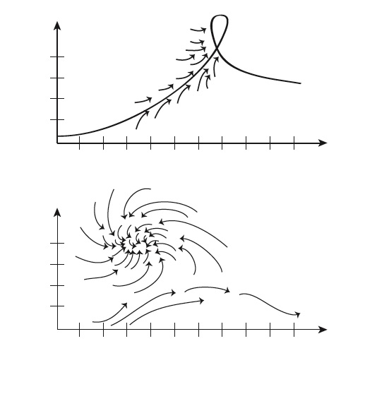
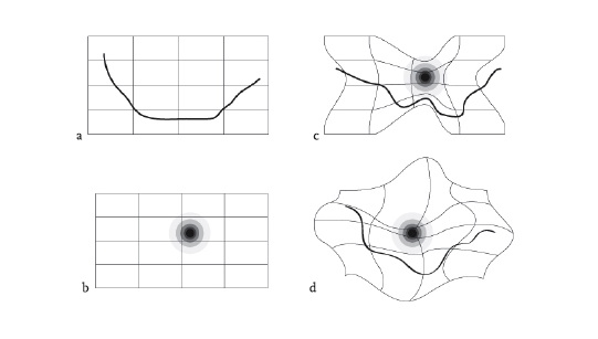
Methods for graphing the elastic or “rubber-sheet” timelines meant to show the subjective
variations in temporality can be derived from catastrophe theory, chaos diagrams, and the
visualizations of stochastic and complex systems.
These visualizations express the topological and systemic complexity necessary
to model the number of variables (of coordinates, forces, and the changing relations of
variables) present in the experience of events, and/or analysis of their representation in
humanistic documents (e.g. novels, films, letters, etc.). Some of the features of our
earlier design, such as the dynamic behaviors of syntactic relations, could not be
expressed in a standard Cartesian coordinate system (such as the one on which XML output
is generated), even though dynamic and performative syntactic relations can be made
operational by using vectors or forces.
But even standard coordinate systems, such as the conventions of perspectival
drawing, allow for the interpretative quality temporal experience to be expressed more
fully than is possible with standard timelines. A parallax view, in which prospective
anticipation is gradually replaced with retrospective reassessment, can be generated with
a slider that animates the dynamic transformation in the value, identity, and relation of
temporal events. In such a view, temporal events expressed as a set of conditions, rather
than givens. The slider indicates a point of view, a perspective from which the experience
of temporality originates in an individual.
By breaking the relentlessly regular grid, the potential for graphing temporal
modeling as a complex system of events is greatly enhanced. The relational, and
co-dependent quality of temporal events finds its expression in these more sophisticated
models
Several fundamental principles can now guide these designs. These principles of
non-continuous, non-homogenous, and multi-directional temporality, as well as
the point of view parallax, refine the reductive crudeness of models linked to standard a
priori metrics of uni-directional, continuous, homogenous time. In this
refinement temporality is conceived according to the basic formulation mentioned above:
time as a function of x (temporality= time (x)). In these formulations, x is any of the
(theoretically infinite) variables that inflect the model (mood, events, influences,
events, constraints, etc.). Because temporality is an act of form-making (constructivist),
not an act of expressing pre-existing or a priori phenomena (realism), the sequence of
intellectual events in this formulation insists on temporality (and, likewise, spatiality
as the result of constitutive relations among temporal and spatial phenomena. The full
realization of this approach requires a multi-dimensional, complex, model of space and
time and imaginative realizations as graphical expression.
Space as Spatiality
The discussion of space corresponds exactly to that of time, and the distinctions between
the conception of space as an a priori given and that of space as relationally constituted
marks the same philosophical division of approaches as those that are used in charting or
understanding time and temporality. Likewise, spatiality is to be understood as space as a
function of x (spatiality= space
(x)).
[4]
To give graphical expression to these ideas requires using non-standard metrics,
intuitive and subjective principles of design. They are meant as provocations to the
larger project of creating more systematic renderings of humanistic phenomena, introducing
basic transformations of the graphical fields we created for time lines into mapping and
GIS applications. Precedents for such renderings can be found–e.g. Francis Galton’s
rendering of space as a function of travel time. Galton’s problem, formulated in the mid
19th century, takes into account that most statistical phenomena are observer-dependent
and situated, and can’t be separated from the various dependencies that bear upon the
creation of data. Galton, in other words, recognized that in many circumstances, data were
capta. The statistical description of phenomena depend upon the observer’s circumstances.
A more recent demonstration of these principles is a map designed by Tom Carden. His
dynamic interface redraws the London Underground map as function of time of travel from
any selected station to any other station.
[5]
Subjective parameters are even more difficult to inscribe, since they cannot, by
definition, be based on simple consensual standards. We can easily understand these
distortions– space as a result of travel time. But how could we visualize the spatial
distortions introduced by variables such as fearfulness, anxiety, anticipation,
distraction, or dalliance and thus render space as spatiality, space as a factor of
x? Some variable is always in play in the experience of space as well as its
representation, so space is also always constructed according to a specific agenda and a
situated experience etc. While this is the common experience of the phenomenal world,
representations of spatiality have lagged behind, dominated by the navigational or
descriptive systems of standard mapping whose conventions are well known and recognized,
and which partake of and impose the dominant realist model.
In proposing a new model for humanities’ work, I am suggesting that the subjective
display of humanistic phenomena can be applied across the domains with which we are
concerned at at least four basic levels of interpretation or knowledge production.
- Modelling phenomenological experience in the making of
humanities (data as capta, primary modeling, the representation of temporal and
spatial experience);
- Modeling relations among humanities documents i.e. discourse fields (a different
metric is needed to understand dates on diplomatic documents in the spring of 1944
than one needed to constitute understanding of those dated to the same period of the
spring of 1950 etc.);
- Modeling the representations of temporality and spatiality that are in humanities
documents (narrative is the most obvious);
- Modeling the interpretation of any of the above (depicting or graphing the
performative quality of interpretation).
Let me describe a concrete
example and see how it can be understood across these four different models. Take the
first instance, the modeling of a phenomenon. Three people are waiting for a bus, how long
does it take? One is late for work and anxious, one is in desperate need of a bathroom,
and the other does not want to go to the afterschool program. How can the variations in
perception be expressed? Recent experiments on the way time is understood in relation to
different circumstances and tasks have made this experiential variable apparent to
psychologists. So, the initial graphical expression of the humanistic phenomenon requires
a variable metric, an elastic timeline, even a field that might fold or break under
extreme circumstances.
When we shift from modeling experience to find graphical expressions for the
representation of experience, the complexity of the problem increases. The modeling of
time in documents, in relation to the duration of the documents (time of telling) and the
experiences they recount (the time of the told) as well as the relations among these and
possible external temporal references, forms a subset of linguistic and narrative
analyses. The graphical forms to represent these are generally inadequate to the
complexity of the textual or visual (and/or filmic and audio) documents.
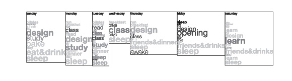
Modelling the temporal relations among documents about temporal experience (imagine
letters, emails, text messages, or diary entries from these various bus riders, only some
of which is date stamped), gives rise to yet further ambiguities and complexities. A
letter sent that was delayed, email re-routed, messages held in suspense on a server will
change the temporal effect. For instance, letters or emails arranging family events and
travels over the holidays contain many temporal values that are contingent on each other
and often in constant flux as plans are being made. The temporal sequence and the date
stamps are not one and the same, a temporal relation of the exchanges might include
messages that cross in mid-stream, and whose temporal sequence does not match the simple
alignment with dates on a line.
Plans change, travel times are altered, arrivals and departures re-arranged, moods shift,
frustrations intensify, disappointments or unexpected surprises arise in relation to the
sequence of events. An email recounting something that occurred “yesterday” in relation to
a date stamp might also contain more vaguely identified “earlier” and “before” statements
that put events into a relative sequence without explicitly identifying when these
occurred. As the telling unfolds, these relations may change in the writer’s expression
and perception, so that the textual description of a recollected event continues to shift
its place in the temporal order. Who was supposed to do what when and who was depending on
which order of events? By the time holiday travels and expectations are sorted out, each
family member has a very distinct view of what happened when and how the sequence of lived
events occurred and where. Was the bus station large or small, far or near to any other
spot in the itinerary, or located in a familiar landscape. How was the space experienced
as a function of time spent in it? These constructions of temporality and spatiality from
within documents, across documents or a discourse field, and of phenomena are all created
with time/space as functions of interpretation. The act of interpreting a series of
documents creates its own temporality, that of the production of a reading, that is not
the same as the telling or the told within the documents, but an independent phenomenon.
An interpretation has its own temporality ad spatiality.
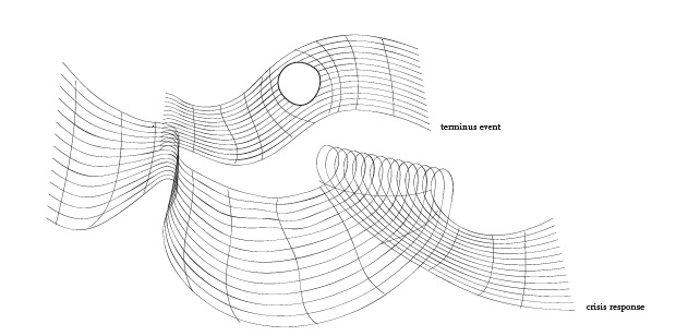
We can construct a concrete example of spatiality that parallels this example of
temporality, and also depends on temporal models. For instance, imagine an open stretch of
beach, relatively unconstrained and unconstructed. When a sailing ship is washed up at a
certain point on the beach, not only that point, but the space around it, becomes
transformed. The presence of the wreck creates a huge impact, and the space almost
palpably bends, compresses, expands, and warps around it, with waves of resonance rippling
outward from that point.
Police barriers are set up and suddenly make that bit of beach into a highly
charged site. Additional fences create zones of potential transgression and prohibition,
lines in the literal sand that when crossed by graffiti artists and taggers, vandals and
looters, introduce a whole set of spatial relations governed by different rules and
expectations. The space of and around the shipwreck becomes a hot point, a zone, an arena
of complex spatial negotiations and marked coordinates, each differently charged depending
on the players and circumstances (law enforcement, owners, passersby, taggers at night, in
early morning, broad daylight etc.). Even more than the open, indeterminate space of the
beach, this spot becomes an area of shifting values and interpretation. Space, always
marked, has become explicitly so, and the spatial relations demarcate regions of authority
and behavior whose dimensions are not in strict correspondence to physical space. The same
amount of physical space half a mile down the beach has none (or few) of these dimensions.
Can we still locate the wreck on a Cartesian grid available through any GPS system? Of
course, the two approaches, constructivist and realist, don’t cancel each other out. But
they are not equivalent. The GPS standards locate the spot within those coordinates, but
say nothing about the constituted space as a phenomenon created by these many variables.
We have many adequate models for the first mode of visualization, but very few for the
constructivist approach grounded in an interpretative mode of experience.
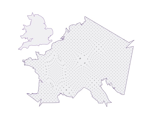
Take another example, a map tracing a journey between London and Prague in the
1810s.
[6]; How does the space change dimensions to reflect hazard, delays,
dalliances, terrain changes, interruptions of war and political strife, danger, weather,
or illness? A legend or set of labels or markings could indicate these inflections of the
space simply by putting symbols on a map. That would be the registration of
subjective data on a conventional map. But mapping conventions don’t morph
the landscape to accommodate the effects of fear, anger, or violence. Now change the map,
distort its proportions so that it becomes a terrain shaped by fear, by obstacles, by
disruptions and confusions.
That is a subjective expression. The two approaches are radically
different. In the second instance, space is an effect of spatial relations, spatiality is
expressed as a factor of disturbance, and it might be expressed as a factor of many
variables occurring across a temporal extension (fear, anxiety, confusion, anger,
disorientation).
The challenge of representing large corpora of texts and immense archives also requires
attention, in part because the conventions of wayfinding and navigation that are part of
print media and its institutional structures are not yet reworked in a digital environment
meant to address the shifts in scale and experience brought on by new media. On top of the
challenge of representing repositories and their use, we can point to another challenge
–that of giving graphical expression to interpretations built on and out of documents, or
collections of documents. These present different challenges than the humanistic
interpretation of temporal, spatial, and informational phenomena, but depend upon the
basic recognition that subjective and co-dependent principles must govern their design.
The conventional graphical features of texts that inscribe interpretation include all of
the features of layout and format, typography, and design that organize and structure its
presentation on the page, screen, or other surface or medium. The features that inscribe
interpretation in archives are those that embody or express the imprint of the point of
view according to which the archive takes shape. These include classification systems,
nomenclature, hierarchies and categories of organization and ordering, systems of search
and access, information architecture, the format of storage and display, and any other
feature of the archive that is intrinsic to the forms of its expression. While all of
these are expressions of arguments, and thus interpretations, they do not show or model
interpretation on the fly as a constitutive act of reading, relating, connecting, and
sense making. In sum, these acts of interpretation make use of the format features of
graphical presentation as well as responding to and thus producing the “content” of these
artifacts. Some combination of user-centered but co-dependent systems analysis and
critical reading practices as performative acts would have to underpin such graphical
visualizations. But that is also work for another time.
Conclusion
My argument is a polemical call to humanists to think differently about the graphical
expressions in use in digital environments. A fundamental prejudice, I suggest, is
introduced by conceiving of data within any humanistic interpretative frame on a
conventional, uncritical, statistical basis. Few social scientists would proceed this way,
and the abandonment of interpretation in favor of a naïve approach to statistical
certainly skews the game from the outset in favor of a belief that data is
intrinsically quantitative — self-evident, value neutral, and
observer-independent. This belief excludes the possibilities of conceiving data as
qualitative, co-dependently constituted — in other words, of recognizing
that all data is capta.
Again, to reiterate, I am not suggesting that we simply introduce a quantitative analysis
of qualitative experience into our data sets. I am suggesting that we rethink the
foundation of the way data are conceived as capta by shifting
its terms from certainty to ambiguity and find graphical means of expressing
interpretative complexity. In some circumstances (the example of the bar chart given
earlier that was displaying information about gender, nations, and populations) ambiguity
merely requires a higher order level of complexity in the model, so that apparent
“certainties” are qualified by variables and nuances that can be specified in mathematical
terms. But the idea of capta as fundamentally co-dependent, constituted relationally,
between observer and observed phenomena, is fundamentally different from the concept of
data created as an observer-independent phenomena. That realization has to be at the heart
of humanistic approaches to the graphical display of interpretative phenomena, of
interpreted artifacts and the acts of interpretation themselves. Because interpretation is
performative, bringing objects into view through a reading or other act of intervention,
it forecloses the possibility that autonomous objects or phenomena exist within the
horizon of human experience. Phenomena of human experience are constituted as
interpretative acts.
The natural world and its cultural corollary exist, but the humanistic concept of
knowledge depends upon the interplay between a situated and circumstantial viewer and the
objects or experiences under examination and interpretation. That is the basic definition
of humanistic knowledge, and its graphical display must be specific to this definition in
its very foundational principles. The challenge is enormous, but essential, if the
humanistic worldview, grounded in the recognition of the interpretative nature of
knowledge, is to be part of the graphical expressions that come into play in the digital
environment. If we don’t engage with this challenge, we give the game away in advance,
ceding the territory of interpretation to the ruling authority of certainty established on
the false claims of observer-independent objectivity in the “visual display of
quantitative information.”
[7]
I’ll finish with one more concrete example of the shift from observer-independent realism
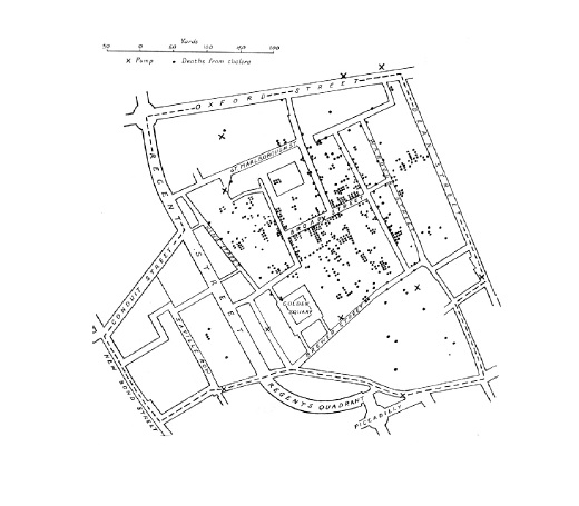
to co-dependent constructivism. Snow’s justly famous chart of deaths from cholera allowed
city officials to track the source of the epidemic to a single water pump.
The distribution of dots on the street map makes evident the role of the pump by
the way they cluster. A useful map, crucial to analysis, its clarity and succinctness
served an important purpose. It was sufficient to that purpose, adequate, but we could
revisit that map and use it to express other factors. Who are those dots? Each individual
had a profile, age, size, health, economic potential, family and social roles. In short,
each dot represents a life, and none of these are identical. Many demographic features
could be layered into this map to create a more complex statistical view of the epidemic.
That is neither subjective data nor a subjective display. But what if we take the rate of
deaths, their frequency, and chart that on a temporal axis inflected by increasing panic.
Then give a graphical expression to the shape of the terrain, that urban streetscape, as
it is redrawn to express the emotional landscape. Then imagine drawing this same
streetscape from the point of view of a mother of six young children, a recent widow, a
small child, or an elderly man whose son has just died.
These latter are all instances of the graphical expression of humanistic interpretation. They are as different from the
visual display of quantitative information as a close reading of a poem is from the chart
of an eye tracker following movements across a printed page. They are fundamentally
different in character and in their basic assumptions about the role of graphical
expression as an aspect of knowledge production. We have a very long way to go in creating
graphical expressions that serve humanistic interpretation, but I hope I have suggested
some of the premises on which this work might begin.
Works Cited
Anderson 2007
Anderson, Margo.
“Quantitative History”, The Sage Handbook of
Social Science Methodology, ed. William Outwaite and Stephen Turner, London:
Sage Publications, 2007, 246-63.
Anderson 2008
Anderson, Margo. “The Census, Audiences, and Publics”, Presidential Address, Social Science History 32:1, Spring 2008, 1-18.
Griethe & Schumann 2006
Griethe, Henning
and Heidrun Schumann. “Visualizing Uncertainty for Improved
Decision Making”, SimVis 2006, 143-156.
Jones et. al 2008
Jones, Josh, Remco Chang, Thomas
Butkiewicz and William Ribarsky. “Visualizing uncertainty
for geographical information in the terrorism database”,
SPIE Security
Symposium, 2008.
dvg.uncc.edu/publications/index.html
Knorr-Cetina & Amann 1990
Knorr-Centina,
Karin and Klaus Amann. “Image Dissection in Natural
Scientific Inquiry”, Science, Technology, and Human Values, 15: 1990, 259.
Latour 1986
Latour, Bruno. “Visualization and Cognition: Drawing Things Together”, Knowledge and Society, 6: 1986, 1-40.
Lochlann 2010
Lochlann, Jain.“ Morality Effect: Counting the Dead in the Cancer Trail”, Public Culture.
2010, 89-117.
Lynch & Woolgan 1988
Lynch, Michael, and
Steve Woolgar. “Introduction: Sociological Orientations to
Representational Practice in Science”, Human
Studies, 11: 1988, 99-116.
MacEachren et. al 2005
MacEachren, Alan M.,
Anthony Robinson, Susan Hopper, Steven Gardner, Robert Murray, Mark Gahegan and
Elisabeth Hetzler. “Visualizing Geospatial Information
Uncertainty: What We Know and What We Need to Know”,
Cartography and Geographic Information Science, Vol. 32, No. 3: 2005, 139-160.
Porter 1995
Porter, Ted. Trust in Numbers: The Pursuit of Objectivity, Princeton, NJ:
Princeton University Press, 1995.